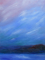
Peach sunrise – 3 Feb 2011

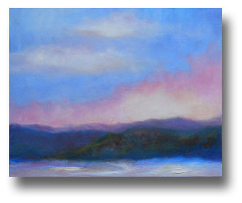
Sunrises in NH can display the most amazing colors.  The peaches and sherbet-pink colors from the rising sun… they’re often astonishing.

This is an 8″ x 10″ oil painting of the sunrise on February 3rd.

For just a few minutes, the clouds seemed to come alive with color, like a daytime aurora borealis. When I saw that starting to happen last Thursday morning — the day after a massive snowstorm — I headed straight to my canvas to capture it.

Blues are my favorite colors.  However, the play of color — such as the pinks and peaches of clouds against the blue sky — there’s a moment of magic when that happens, and that’s what inspired this plein air painting from our front porch.


Peach Sunrise
3 Feb 2011
8″ x 10″ Oil painting on archival canvas board
Unframed


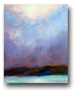
After the Storm – 28 Jan 2011

Yesterday during the late afternoon, a snow storm brushed us.  It didn’t leave much snow, but the clouds had looked ominous as they passed overhead.

As the sky began to clear, revealing a very pale pink sunset, I grabbed an 8″ x 10″ canvas board and quickly captured the colors in oil paints.

The photo is fairly accurate, but the foreground colors aren’t quite as vivid as they look on my monitor, and the sky is more softly blended.

All in all, it was a good sketch and I’ll probably is it to inspire a larger painting on this, as well.

Though some brushwork brings the hills and foreground toward the viewer, most of this painting is almost glassy smooth.  I’m using sable brushes in more of my work now, and I think I like the effect.

My color studies and hasty sketches will probably continue to include thick paint and obvious brush strokes.

However, I want to experiment with more Luminist and Tonalist influences in the immediate future.  That means a softer overall impression in my work, with smoother surfaces and very blended colors.  (See my discussion of this in my post, Sunset – Sunrise Paintings.)

After the Storm
created 28 Jan 2011
oil painting on 8″ x 10″ canvas board

Sunset – Sunrise Paintings

As an artist, this is interesting.  I feel as if I’m finding my personal voice in terms of influences: Impressionism v. Tonalist & Luminist art. (Those links open in a new window and take you to Wikipedia.)

For me, Impressionism includes apparently disconnected colors & textures (at least, up close) that create the visual and emotional impression of the scene.

Tonalism is less about color and more about misty, foggy, or mostly-dark scenery and (often) a glassy surface to the finished work.  Sunrise 28 jan 2011 - detail

In many cases, both styles are best viewed from a distance of 20 feet or more. That almost always applies to my paintings.

Luminism — which came before Impressionism — is more about the glow, and it’s currently a leading influence in all of my work.  (See work by James Augustus Suydam for the glow I’m talking about, and Sunlight and Shadow by Martin Johnson Heade for the colors.)

I also keep revisiting the images from the Like Breath on Glass exhibit, and the audio tour (with images) that’s online.  There’s something wonderfully rich but also eerie about many of the paintings.  For me, they’re compelling and hauntingly lovely.

So, I’m experimenting with different painting styles, pushing my limits and then absorbing what I learn from each experience.

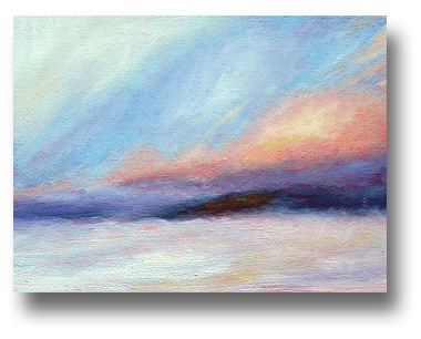
The painting shown above is this morning’s sunrise study. It shows a fleeting moment and the rapidly changing skies.  The original is 9″ x 12″ on canvas board.

At right is a detail from the painting.  That’s about a one-inch section of the canvas, from top to bottom.

I think I’m moving away from harsh edges, though many of my sketches will — by necessity of the time available — look somewhat sloppy and ragged.  For me, capturing the light & color at the moment I see it is key.  The urgency in those works is clear, and has its own merits in terms of visual and emotional energy.

Many of those quick sketches will be resources for later, larger, more Luminist works.

Last night, I’d worked after dark, creating a color study inspired by the sunset.  As usual, I was challenged by artificial light (v. painting in the dark) and — when I saw the painting this morning — I wasn’t satisfied with it.
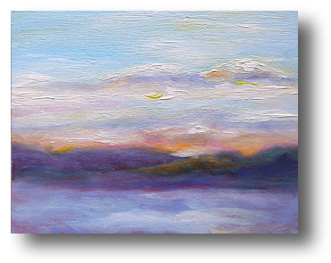
Sunset 27 Jan 2011That’s it at left, after I worked on it this morning. Fortunately, minor tweaks restored the creative vision that had sparked the work.

I feel as if I’m finding the middle ground (no pun intended) between soft edges and color contrasts.

I’m not entirely sure where this is going, but I’m pleased with my progress.

And, of course, I woke up in the middle of the night with an idea for an abstract painting… and had to sketch it immediately, with notes.

In other words, my art is still a juggling act with a variety of inspirations and influences.

I’m not sure that I’d want it any other way.

Spring 2010 – Revisited

Sometimes I look at an older painting and it’s lacking something.  Oh, it’s often “nice enough,” but… well, that’s not enough for me unless it was just a quick sketch.

My March 2010 painting, Spring is on the way, was like that.  It just didn’t have the oomph that I wanted; that may be partly because it was a difficult week for my family.  Sometimes I paint just to keep busy while I’m processing challenges in my life.  When I’m not fully committed to the art, particularly in terms of my emotions, the finished work can seem a little lackluster.

Also, I’ve learned a lot about color and technique since then.

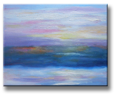
Anyway, feeling very pleased with the improvements in Orange Hills, Revisited, I decided to improve the spring painting as well.  That’s the finished version, above.

Much of the work involved bringing the colors forward, and softening the areas that weren’t well-defined. Sometimes when I keep fussing with part of a painting, the area doesn’t emerge clearly and the busy-ness of it detracts from the finished work.

Spring revisited, detailThat’s what happened with the previous version of this painting.
This week, I was reminded of when I studied art with Larry Gluck, and he’d talk about turning paintings into “little gems.”  That’s what I was doing with this canvas.  (And yes, it is fairly little at 8″ x 10″.)

Fortunately, this week’s landscape colors were surprisingly similar to when I began this painting last March.  (With the winter we’ve had so far, I’m hoping it’s an indication of an early spring, as well.)

On the right, you can see part of the canvas, suggesting the subtle colors and the varied brushstrokes.

I’m very pleased with this painting, now that I’ve polished it into a more vibrant and representative work.  The emotional content is richer, too.

The colors and textures have depth.  I look at this painting and smile, because it’s tremendously evocative.

I’m still learning when to leave a good painting alone, and when my art can be improved upon with just a little finesse.

With this painting, the latter was definitely the case and the final product is truly good.

Orange Hills Revisited

This is an example of what happens when I look at one of my earlier sketches and all I feel is, “Well, it’s okay…”

I started with the oil sketch from January 8th, the Orange Hills at Sunset painting.  Frankly, I was going to put it into eBay at a low starting price, just to keep the art moving.  (If art just sits in my studio, I reach a point where I stop painting… creating empty space is vital!)

However, I just couldn’t do it.  I mean, I don’t want to wince when I think of ho-hum paintings out there, when they could be so much better.

After about an hour of tweaking the eBay auction — never fully satisfied with it — I gave up and removed the auction listing.  I put the canvas back on my easel and started working on it.  This wasn’t just sketching… I wanted to push the colors into a far higher realm.

Of course, it helped that the sunset outside my window was cooperating.

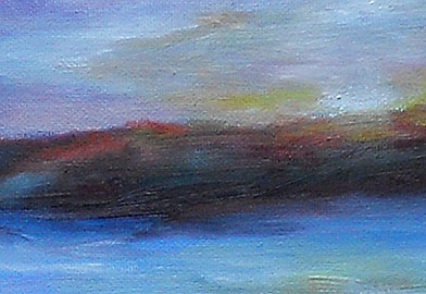
At right, you can see an actual-size detail from the painting.  I added a lot of color to bring the hills to life, and to give the sky more energy.

The original painting is lighter and more vibrant than this photo, but the picture shares the general idea.  If you compare it with the sketch as completed on January 8th, you can probably see a significant improvement.

When the painting was finished, about an hour later, I decided that this will be a gift for HT’s mom.  She’s a wonderful woman and I want her to have some of my artwork.


Orange Hills, Revisited
NH landscape at sunset
9″ x 12″ oil painting on canvas board
21 January 2011
Private collection

Another Flurry Variation … Sort Of

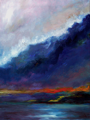
This is my 18″ x 24″ oil painting, Flurries Variation (13 Jan 2011). It’s sort of a landscape, but also an abstract.

To be honest, it’s a bit of an enigma for me.  Here’s the story:

After I’d sketched-in the larger flurry painting – which turned out as a very high-key painting – I wanted to create a far more muted version.

The inspiration was my “Flurries at Dusk” oil sketch, shown below.

(Click on that image to see it larger and read more about it.)

My original vision for this variation had been the somber colors of the snowy evening, contrasted with the vivid colors on the nearby hills, especially near the crest of the hills.

So, I was determined to work with a very limited group of colors on my palette, and mute them as much as possible.

At the hills, I wanted to exaggerate the remaining reds and oranges left from the fall foliage.  Though the colors are actually very brownish in real life, it’s still possible to envision what they were like at peak foliage.

Flurries near dusk - 7 Jan 2011 painting
This sketch inspired the larger, more dramatic work.

In the foreground, I wanted just a hint of the light reflecting off the fresh snow.

Two days later, it had gradually transformed into something very different.  The colors are eerie, almost gothic. I still don’t fully understand what it is.

As the painting progressed, I began to get the idea that the dark mass was actually a forest, the yellow & orange colors represented a road — perhaps like the road along the fjord at Acadia National Park in Maine — and the foreground was the ocean.

Well, maybe.

Then, as I muted the sky colors and added what I thought was a white border of clouds, the scene looked like a storm.  The large, dark area could even be a huge wave, and the white would be the froth on top of it.  (HT suggested that it was a wave putting out the fire, represented by the yellow & orange notes.)

It’s so unlike my usual work, I didn’t know what to think.  I still don’t.  Not really.

At first, I’d decided to put this painting aside before deciding if it was finished.  Then, a friend sent me a link to something an acquaintance – astrologer Michael Lutin – said about ongoing social changes being like a tsunami.

For some reason, that clicked for me.  I’m not sure why, and I still don’t know if this painting is symbolic, lyrical or literal… and what it means.

However, I decided that this painting is complete, and I shouldn’t change anything about it.

So, there it is.

About this painting:
Flurries Variation
Oil on canvas
18″ x 24″
13 Jan 2011
Private collection