Another Flurry Variation … Sort Of

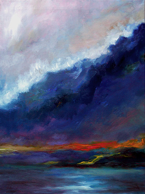
This is my 18″ x 24″ oil painting, Flurries Variation (13 Jan 2011). It’s sort of a landscape, but also an abstract.

To be honest, it’s a bit of an enigma for me.  Here’s the story:

After I’d sketched-in the larger flurry painting – which turned out as a very high-key painting – I wanted to create a far more muted version.

The inspiration was my “Flurries at Dusk” oil sketch, shown below.

(Click on that image to see it larger and read more about it.)

My original vision for this variation had been the somber colors of the snowy evening, contrasted with the vivid colors on the nearby hills, especially near the crest of the hills.

So, I was determined to work with a very limited group of colors on my palette, and mute them as much as possible.

At the hills, I wanted to exaggerate the remaining reds and oranges left from the fall foliage.  Though the colors are actually very brownish in real life, it’s still possible to envision what they were like at peak foliage.
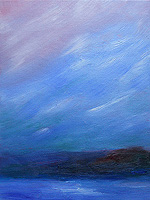
Flurries near dusk - 7 Jan 2011 painting
This sketch inspired the larger, more dramatic work.

In the foreground, I wanted just a hint of the light reflecting off the fresh snow.

Two days later, it had gradually transformed into something very different.  The colors are eerie, almost gothic. I still don’t fully understand what it is.

As the painting progressed, I began to get the idea that the dark mass was actually a forest, the yellow & orange colors represented a road — perhaps like the road along the fjord at Acadia National Park in Maine — and the foreground was the ocean.

Well, maybe.

Then, as I muted the sky colors and added what I thought was a white border of clouds, the scene looked like a storm.  The large, dark area could even be a huge wave, and the white would be the froth on top of it.  (HT suggested that it was a wave putting out the fire, represented by the yellow & orange notes.)

It’s so unlike my usual work, I didn’t know what to think.  I still don’t.  Not really.

At first, I’d decided to put this painting aside before deciding if it was finished.  Then, a friend sent me a link to something an acquaintance – astrologer Michael Lutin – said about ongoing social changes being like a tsunami.

For some reason, that clicked for me.  I’m not sure why, and I still don’t know if this painting is symbolic, lyrical or literal… and what it means.

However, I decided that this painting is complete, and I shouldn’t change anything about it.

So, there it is.

About this painting:
Flurries Variation
Oil on canvas
18″ x 24″
13 Jan 2011
Private collection

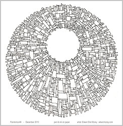
Pandorica #4

This was one of my free, one-day downloads.

For 24 hours (17 – 18 Jan 2011), people could download a printable copy of my b&w fine art drawing, Pandorica #4.  It would print on an 8.5″ x 11″ sheet of white paper at 150 pixels/inch.

This was the first of my one-day downloads. From time to time, I’ll offer print-quality downloads of my artwork, but — due to file sizes and bandwidth — they’ll be available for 24 hours or less.  After that, the file will be removed from the Internet.

I’ll announce them here, and at social media.

Sunrise – Snowy Skies – 14 Jan 2011

This morning’s skies looked ominous at first, and the colors were there for just a couple of minutes.  I was glad that I’d already set out my palette with the colors I was likely to need.

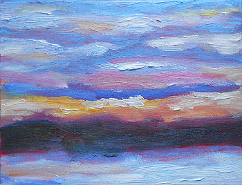
This was a small, fast oil sketch on an 8″ x 10″ canvasboard.

Many sunrises feature the brightest colors dusted on the surface of the clouds.  This was one of those other mornings, when the colors were inherent to the sky, and acted as a backdrop for clouds ranging from white to lilac to lavender.

Sunrise painting - detail - 14 jan 2011The snow reflects the skies colors, so it was like watching a flashing sign or something, as the snow went from muted blues and greys to shades of peach and orange… just for a second.
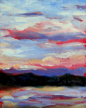
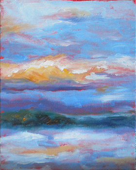
When I work this quickly, the paint runs the gamut of something thick like lathered butter to just grazed color as my brush skims the surface of the canvas.

At right, that’s about a 1 1/2″ section of the canvas, to show you the textures, colors and brushstrokes in the work.

Since I plan to clean off my palette today, I was freer with the white paint than usual.  It’s a habit that I want to get into.  (Using the paint with more freedom and abandon, that is.)

On my errands today, I’ll be buying more paint.  This time, I’m investing in the big tubes of white and blue.  I usually buy white in volume, but since I mix most of my colors from red, yellow and blue, I’m going through a lot of blue (French Ultramarine blue) with the sky and the snowcover.

I’m really enjoying starting my day with these sketches.  The art puts me in a strong and happy frame of mind, and I think everything else goes better when I begin the morning like that.

And, yes, my computer keyboard now has paint on it.  I didn’t clean my hands — which always end up with paint on them — before sitting down to post this.

It’s time for me to get ready for a day of errands now… with a smile because I was able to capture a truly lovely (if fleeting) sunrise.

Sunrises – Two More – 13 Jan 2011

It was another sunrise with quickly-changing skies.  I had to work very quickly to capture the colors on these two 8″ x 10″ canvasboards.

The first one includes darker colors and higher contrast. (In real life, the reds aren’t that vivid, blue-ish, or light.)

The sun was just coming up (in back of me) and so the hills were still very dark… but the painting’s hills are a lighter green than in this photo.

Mostly, the higher clouds and sky caught the sun’s rays; everything else was relatively dark and sometimes subdued.

The morning’s second oil sketch is below.  As you can see, the contrast was not so extreme and the hills were lit by the sunlight.

The snow was whiter, the red in the sky was diminished, and the clouds were fluffier and more clearly defined.

If I’d been painting realistically, it was the kind of sky where an artist would be tempted to add a colorful hot air balloon.  It was that kind of “picture perfect” coloring, and almost too-perfect cloud formations.

NH sunrise #2 - 13 jan 2011Mostly, these are color references.  They were so hastily worked, unless someone already knows that the subject is a band of trees on a hill, with snow in the foreground… well, I’m not sure that it’s representational enough to discern the subject.
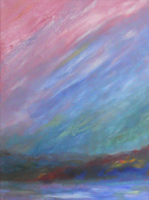
Because of the pace of my work yesterday morning (when I painted these), the colors are fairly vivid.  They’re far more energetic than they look in the photos; I’m still learning how to tweak the colors with this new camera.

Later in the day, I completed another, full-size painting.  However, I wasn’t going to post it here because it’s not my usual style or subject.  In fact, it has an odd backstory.

However, I’m waiting for the right light because the colors are a little difficult to capture in a photo.  And, since I’ll be out most of today, I may not have that painting posted here until early next week.

Flurries at Dusk, Revisited – 13 Jan 2011

With some minor changes, the larger Flurries at Dusk painting is now completed.

(See the nearly completed version plus backstory, here. Mostly, I added contrast in some areas, and softened the white areas in the sky.)

It’s a higher key than I’d expected, but I’m pleased with the lyrical quality of the color.

The completed work is 18″ x 24″ on stretched canvas.

I like how far I pushed the colors in this piece.  It’s not quite what I’d planned to paint, working from the original sketch, but… well, it’s a pretty painting.

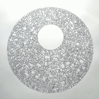
Pandorica 5 – Completed

This weekend, I completed the fifth of my Pandorica-inspired drawings.

This is the first of the bigger drawings.

The circle is about 10 1/2″ across, and it’s drawn on a 14″ x 17″ sheet of paper.

The design was drawn, one block at a time, using a zero-point Koh-i-Noor drawing pen and black India ink.

First, I draw guidelines in pencil, to indicate the circles and a few angled lines so the blocks don’t get too skewed in relation to the whole.

Everything else is drawn, freehand and intuitively, with an eye to keeping the piece in balance as I work.

Like many non-representational works, one goal of this piece is to keep the eye moving around it.  There may be areas that attract your attention, but it’s fleeting attention… you don’t linger there, but keep scanning the work.

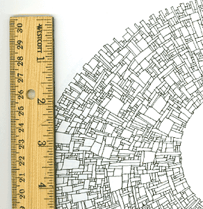
Below, a scan of the drawing (next to a ruler) shows the approximate size of  the blocks.  Most of the blocks range from 1/32″ square up to those with sides about 3/4″.

The work is inspired by the dimensional art on the Pandorica in recent Dr. Who episodes, as well as the Mayan calendar, mandalas, and other circular works.

Pandorica detail