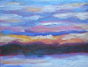
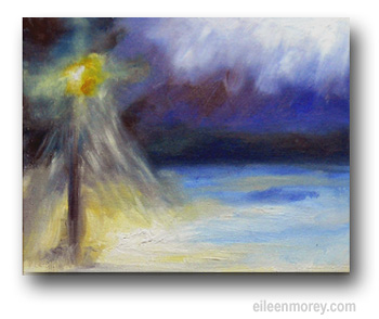
Sometimes I forget that others — even those who work with color studies — may not “see” the art in some of my more urgent, sometimes fragmented works.
Here’s how one color study is leading to a series of landscape paintings.
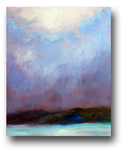
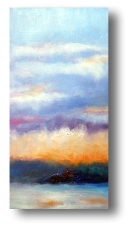
The large photo shows my nearly-finished oil sketch. I painted it this morning.
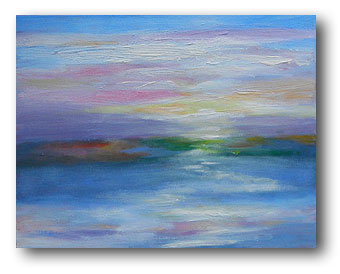
It’s based on Sunrise – Snowy Skies, painted on January 14th. (That color study is shown at the foot of this article.)
The original color study was painted in about half an hour, but it captured the important colors — and variety — in the sky and the snowy foreground.
(Color studies are useful because they capture the energy and impressions of the landscape. I also work from photos, particularly if they’re vivid and extraordinary.)
However, there was an additional step between the original color study and today’s painting. That extra step is shown below, on the right.
Using the January 14th color study as my inspiration and reference, I worked on a traditional painting on an 11″ x 14″ canvas. Paintings like that are sort of visual brainstorming.
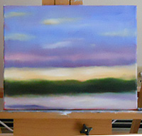 At one point, I paused to photograph it. When this photo (on the right) was taken, the colors were still too isolated; that was fine in the color study, but not for a more formal work.
What I’d learned at that point — and improved after this photo — was to limit the colors and connect more of the masses.
I put that canvas aside to dry before I continue working on it.
Overnight, I thought about the original color study and the creative visions that are emerging from it. As usual, I woke up at 4 a.m. with a very clear mental picture of what I wanted to do.
After another hour of sleep, I was at my easel and painting by the light from my Ott lamp, waiting for sunrise so I could really see the colors in my work.
My only canvas with the correct proportions was an 8″ x 16″ canvas board that I hadn’t sanded enough before using it. So, this painting appears to have brushstrokes that aren’t actually part of the finished work. (Unless the painting is illuminated with a harsh, angled light, the extra texture isn’t very obvious.)
Nevertheless, it’s a truly lovely work of art with lots of softly blended colors. I’m very pleased with it.
I want to heighten the whites in the sky and soften the foreground tones. After that, it’ll be finished and — when it’s dry — it will probably be for sale. However, first option will go to whomever buys the color study that inspired it. I like the idea of someone owning both this painting and the color study that led to it.
In addition, I plan to base at least two more paintings on the original color study, and get them started before the current eBay auction closes.
Here’s the original color study that’s inspiring these works:


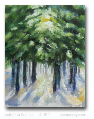
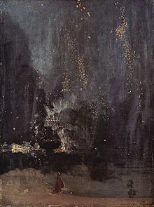 *From the trial in which Whistler sued critic John Ruskin for libel (after Ruskin published harsh criticism of a painting in Whistler’s Nocturne series, shown at right):
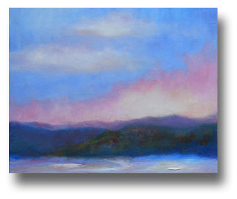
 At one point, I paused to photograph it. When this photo (on the right) was taken, the colors were still too isolated; that was fine in the color study, but not for a more formal work.