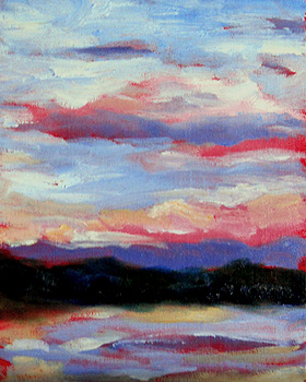
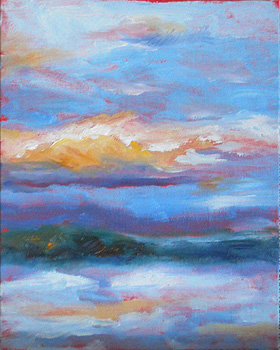
Sunrise – Snowy Skies – 14 Jan 2011

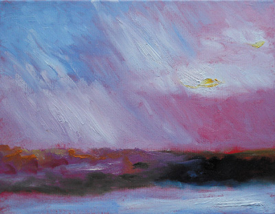
This morning’s skies looked ominous at first, and the colors were there for just a couple of minutes.  I was glad that I’d already set out my palette with the colors I was likely to need.

This was a small, fast oil sketch on an 8″ x 10″ canvasboard.

Many sunrises feature the brightest colors dusted on the surface of the clouds.  This was one of those other mornings, when the colors were inherent to the sky, and acted as a backdrop for clouds ranging from white to lilac to lavender.

Sunrise painting - detail - 14 jan 2011The snow reflects the skies colors, so it was like watching a flashing sign or something, as the snow went from muted blues and greys to shades of peach and orange… just for a second.

When I work this quickly, the paint runs the gamut of something thick like lathered butter to just grazed color as my brush skims the surface of the canvas.

At right, that’s about a 1 1/2″ section of the canvas, to show you the textures, colors and brushstrokes in the work.

Since I plan to clean off my palette today, I was freer with the white paint than usual.  It’s a habit that I want to get into.  (Using the paint with more freedom and abandon, that is.)

On my errands today, I’ll be buying more paint.  This time, I’m investing in the big tubes of white and blue.  I usually buy white in volume, but since I mix most of my colors from red, yellow and blue, I’m going through a lot of blue (French Ultramarine blue) with the sky and the snowcover.

I’m really enjoying starting my day with these sketches.  The art puts me in a strong and happy frame of mind, and I think everything else goes better when I begin the morning like that.

And, yes, my computer keyboard now has paint on it.  I didn’t clean my hands — which always end up with paint on them — before sitting down to post this.

It’s time for me to get ready for a day of errands now… with a smile because I was able to capture a truly lovely (if fleeting) sunrise.

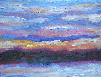
Sunrises – Two More – 13 Jan 2011

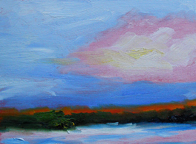
It was another sunrise with quickly-changing skies.  I had to work very quickly to capture the colors on these two 8″ x 10″ canvasboards.

The first one includes darker colors and higher contrast. (In real life, the reds aren’t that vivid, blue-ish, or light.)

The sun was just coming up (in back of me) and so the hills were still very dark… but the painting’s hills are a lighter green than in this photo.

Mostly, the higher clouds and sky caught the sun’s rays; everything else was relatively dark and sometimes subdued.

The morning’s second oil sketch is below.  As you can see, the contrast was not so extreme and the hills were lit by the sunlight.

The snow was whiter, the red in the sky was diminished, and the clouds were fluffier and more clearly defined.

If I’d been painting realistically, it was the kind of sky where an artist would be tempted to add a colorful hot air balloon.  It was that kind of “picture perfect” coloring, and almost too-perfect cloud formations.

NH sunrise #2 - 13 jan 2011Mostly, these are color references.  They were so hastily worked, unless someone already knows that the subject is a band of trees on a hill, with snow in the foreground… well, I’m not sure that it’s representational enough to discern the subject.
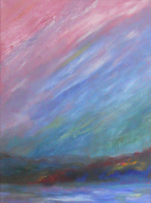
Because of the pace of my work yesterday morning (when I painted these), the colors are fairly vivid.  They’re far more energetic than they look in the photos; I’m still learning how to tweak the colors with this new camera.

Later in the day, I completed another, full-size painting.  However, I wasn’t going to post it here because it’s not my usual style or subject.  In fact, it has an odd backstory.

However, I’m waiting for the right light because the colors are a little difficult to capture in a photo.  And, since I’ll be out most of today, I may not have that painting posted here until early next week.

Flurries at Dusk, Revisited – 13 Jan 2011

With some minor changes, the larger Flurries at Dusk painting is now completed.

(See the nearly completed version plus backstory, here. Mostly, I added contrast in some areas, and softened the white areas in the sky.)

It’s a higher key than I’d expected, but I’m pleased with the lyrical quality of the color.

The completed work is 18″ x 24″ on stretched canvas.

I like how far I pushed the colors in this piece.  It’s not quite what I’d planned to paint, working from the original sketch, but… well, it’s a pretty painting.

Vivid Pink Sunrise – 11 Jan 2011

This is the second of two paintings of this morning’s sunrise.  Within minutes of completing the early sunrise painting, shades of pink seemed to dominate the sky.

Continuing the theme of “urgency” from my previous work, I deliberately chose a larger canvas.  This painting is on an 11″ x 14″ stretched canvas.

My thought was: Since I have to work quickly to capture the scene before the light changes, if the canvases are larger, my work may convey even greater urgency as I hastily scrub in the colors.

So far, this is a successful experiment.  I am very pleased with this painting.

sunrise 2 - pink - detail - 11 jan 2011At right, the photo shows a one-inch band, from top to bottom, in this landscape painting.
Like the previous work, there’s tremendous variety in the thickness of the paint.  In some areas — particularly the clouds and the snow — the paint is thick and juicy.  In others, the cadmium red underpainting and texture of the canvas show through.

The passion of the color and the emotion of the scene were what I wanted to convey.

I think this work has succeeded.

I also think I’m making some tremendous breakthroughs with my recent art, as I push toward greater contrast and more vivid colors.

I may use this oil painting to inspire a larger version with similar colors and energy.

Early Sunrise – 11 Jan 2011

This is the first of this morning’s two oil paintings capturing the sunrise.

I was consciously working with more vivid colors to capture the true impression of the sunrise.

Though I wanted to keep tweaking the painting to get it “just so,” I’m also very inspired by yesterday’s discussion with my daughter, Amber.

As we talked about art in general, she used the term “urgency” to describe what makes the earliest album by U2 so compelling.

Early sunrise - 11 jan 2011 - detailWe agreed that we both like music that’s still raw and untidy, with glaring imperfections almost obscured by powerful emotional content.
That’s what I’m working toward with my art: The raw, emotional content that’s so important in any art form.

So, some of my coming works may be less “tidy” than in the past.  It’s part of the process.

This is an oil painting on 9″ x 12″ canvas board.  The paint is thick and a little unruly, but it’s also very expressive.

The detail at right represents a one-inch section of the painting.

In some areas, the paint was applied thick, quickly and with flourish.  In others, the cadmium red underpainting shows through.

The trees at the horizon are cadmium orange with a suggestion of green between them and the blue band of color immediately above.

For me, this piece captures the vivid tones often overlooked early in the day as the sun is barely visible in interior New Hampshire.

This is an oil painting on a 9″ x 12″ canvasboard.

Quick Tree Sketch – 9 Jan 2011

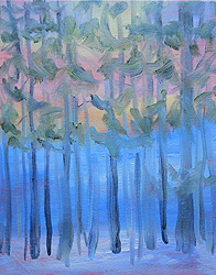
Some of my oil sketches are sort of doodles… quick artwork exploring themes.

That’s a good description of this sketch of the woods near our home.

The purpose of this was to see what would happen if I tried to convey sunset colors through the trees.

It’s a whimsical piece giving me more to think about, as I consider what I want to capture as I paint a different landscape outside my studio windows.

For me, trees are a challenge.  I’m never sure how detailed to make them, and what’s most important to include.  No two artists will make the same decisions about trees.

I think I’m heading toward a more lyrical approach, but… I’m not sure, yet.

This is an 8″ x 10″ oil sketch on canvasboard.

(Note: I later painted over it. See it at Tree Sketch – Evolution Series, Feb 2011.)