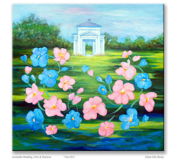
Huntsville Wedding Painting

Like much of my artwork, this Huntsville painting has a story.

It started with a wedding invitation. I hadn’t expected it, but I was flattered. I hadn’t seen the groom since he was a toddler, and I’d never met the bride.

Though I’d never been to the area where the wedding would take place, I felt inspired to paint the couple a wedding gift: A landscape showing where the couple would exchange vows.

At that point, I wasn’t sure I was actually going to the wedding. When I’m not painting, I’m writing books & articles.

Worse, right before the holidays – starting at the first of October, if not earlier – I’m busy. Once we’re approaching Thanksgiving, I like all the work completed for the year, and everything business-y on auto-pilot.

But, I usually enjoy weddings. In addition, years ago I’d made a promise to my mother – a message she wanted me to deliver – and I was certain to see the person at the wedding.

So, with help from my brother, who lives in Alabama, I gathered visual references. Then, I found the perfect canvas.  It’s 36″ x 36″ and a nice, deep gallery wrap. (That means the canvas wraps around the edges. No frame is needed. In fact, it shouldn’t be framed.)

Finally, I was ready to sketch.
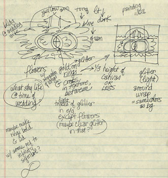
Huntsville wedding sketch 1
First conceptual sketch

The first sketch (at right) was grandiose and impractical. Flowers, trees, interlocking gold rings, a Christian cross in the center, and the outdoor building where they were marrying… Oh, it was fun, but I was trying to do too much with the concept.

The basics…? I knew that I wanted certain colors, including lots of shades of green (for the outdoor setting), and pink & blue flowers. I wanted to include the wedding pavilion. Visually, a circular flow would suggest wedding bands, the circle of life, eternity, and so on.

But, as I studied reference photos, I saw even more flaws in my original idea. Photos showed there was no way the sun could be visible behind the wedding pavilion. (Another building was in back of it.)

Unwilling to abandon my initial idea, I sketched the design (in pencil) on the canvas.

Almost immediately, the wedding rings and cross looked odd. Not like wedding rings.  And, in general, the mish-mash seemed a little too “cutesy.”

So, I went back to the drawing board. Literally.
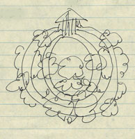
Second sketch- Huntsville wedding
Second sketch

The second sketch (at left) was more successful.

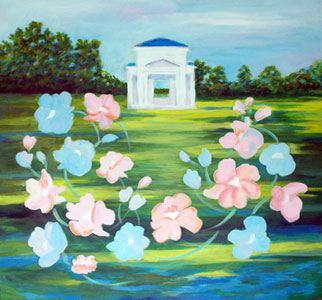
I envisioned the wedding pavilion against a pale blue sky. The foreground would be green and blue, with a Monet vibe.

I wanted bold, Matisse-y flowers, connected with two concentric, gold rings. The latter would be in metallic gold paint, possibly with glittery highlights.

Happy, I ordered the imported paints & brushes I’d need.

While I waited for them to arrive by mail, I started the underpainting. (An underpainting rarely shows through, but it can make the colors “pop” more.)
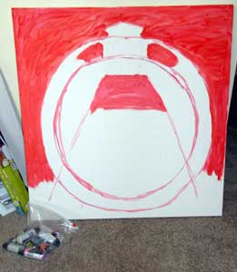
Huntsville wedding - underpainting
My initial underpainting

From my mother (also an artist), I’d learned to study the handwritten notes of my favorite artists. So, based on Monet’s notes, the first layer was cadmium red.

That’s it on the right. I roughed-in the roof of the wedding site and left it white. Then, I underpainted the sky and greenest areas, the concentric circles, plus some central design elements.

So far, so good.

When the paints arrived, I sketched-in the general colors and themes: the sky and grassy area, the building, the rings, and some big white splotches where the flowers would go. I also painted the wrap (the sides of the stretched canvas) to match. It looked good.

I wish I’d photographed the steps that followed, but… I didn’t. The paints arrived late, and I was working day & night to complete the painting on time.

This was about two weeks’ work, and yes, I have enough art experience to work quickly, especially when I’m in “woman on a mission” mode.

I propped the Huntsville painting where I could see it when I was in the kitchen. I moved it so I could study it while eating meals. I turned it so I could glance at it while catching up on news, etc., on the TV.

I kept painting & tweaking, and painting & tweaking.

I didn’t sleep much. That’s because, as the deadline approached, it was better to complete the painting and have peace of mind, than to toss & turn, fretting over this.

Finally, I visited a couple of art supply stores to find the perfect gold (and glitter accents) for the wedding rings.

But, when I painted those rings, they looked weird. Sort of like a bulls-eye design. Sort of like a time tunnel, or how Hitchcock had represented hypnosis or a dream state.
Loosely painted flowers & stems
As I worked on the flower colors, a problem emerged.

Nope. That wasn’t going to work. So, I painted over all the gold & glitter, and worked on the flowers while I thought about it. (That stage is at left.)

After suggesting the flower colors, I added loose, swinging flower stems to create the circular flow I had in mind. They’re fun.

That’s when I saw a balance issue. My attention was drawn to the dark, literal greenery in the upper left corner. The effect was jarring against the whimsical style of the flowers.

So, I repainted the greenery.

Note: Yes, the floral design does fill more of the left than the right. That’s a deliberate choice.

In illustration and in painting, the eye tends to go from left to right.  If you want a happy, uplifting mode, keep the right side as open as possible. Nothing should make the eye come to a halt. The right side of the canvas should suggest cheerful, forward energy.

(By contrast, if you want to represent something sinister, put lots of big, blocking images on the right side of the artwork. If they’re powerful enough, you might even see a physical reaction when someone looks at the piece.)

At this point, I was starting to like my Huntsville painting again. That was a relief. In my experience, any art that doesn’t go through the “oh dear heaven, this is ugly” phase during the process… it’ll hit that point at the end.

It’s better to go through the rough part around the middle of the process. (It’s like that with my writing too. Many writers describe the “awful swampy middle” of their stories. You either persist or you give up; that can be the difference between a successful writer/artist and one that never seems to finish anything.)

And, from that point forward, everything came together.
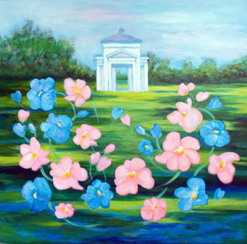
Nearly finished, except for a horizon issue.

On Thursday night (before starting our journey on Friday), I thought the painting was completed. I loved it! Of course, I photographed it to show my oldest daughter. (That’s the photo, on the right.)

In that smaller size – and with a fresh way of looking at the finished work – I could see that the horizon was completely wrong. Comparing the left, right, and inside the wedding building… it didn’t line up at all.

So, after a late-dinner break, I returned to the canvas and repainted portions of it. Now I really liked it.

And, I knew it was almost complete.

At that point, I added a small red dot in “Chinese red” (my mother’s term for a bright, rich red-orange hue). That was one of my mother’s signature elements in many of her paintings. She felt that the energy of a red dot attracted the eye on a subtle level, and – correctly placed -it could balance any painting.

Since this is a family gift, it seemed important to include that nod to my mother. Without her love and encouragement, I might not have become an artist.

The finished  painting is at the top of this page. You can click on the image to see it slightly larger.

We hand-delivered it (after a 14+ hour drive) to the happy couple – Chris & Shannon – in Huntsville, Alabama. I’m proud of this painting, and feel that my mother had some input, at least as an inspiration.

And, I think she’d be proud of this, and happy for the newlyweds.

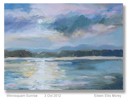
Winnisquam Sunrise

Today, the light is dismal.  It’s grey, flat, and rainy.  Even sitting next to the floor-to-ceiling window on the “sunny” side of our living room, everything looks pretty blah.

To test a painting technique recommended by Peter Wileman (see review, below), I chose a photo I’d taken, earlier this summer.   It’s lovely, and I may get prints made from it, to sell at a local shop.

I did the b&w sketch like Wileman does. Then I did a small sketch in colored pencils.

Finally, I created the oil sketch in the photo. It’s 9″ x 12″ on canvas board.

I’m astonished.  It’s a genuinely good painting, even though it loses a lot in this photo.  (As I said, the light is terrible today.)

Yes, this does look a little like my mother’s work.

I loved many of her paintings, but some were too rote for my liking… and hers.

She swore it was the time spent at Mass. Art, where everything had to be sketched as cubed, spheres, and cones, first.  Then, they were allowed to build their work on top of those geometric forms.

That’s one reason Mum was firm about me not going to art school.

She felt that the training had curbed a lot of her originality.

I spent about an hour on this piece, and I’m not sure if it’s finished yet.  I may see something that I’ll want to change, tomorrow.  Or, I may wait until we have a good sunny day – the weather forecast looks good for Friday – so I can better judge the colors.

Anyway, mimicking some of  Wileman’s style was a good experience.  I know I’ll integrate some of this in future paintings.

And, honestly, for a painting that took me an hour on a dreary day, I’m pleased with the results… more than I expected to be.

Wileman review

Yesterday, I watched Peter Wileman’s full-length video, Painting the Light in Oils.

Here’s a clip from it:

My initial reaction was, “Okay, I learned a few things from watching him work, but I’m more interested in how he created those small, early sketches, not the finished works from them.”

The video introduction was very good.  I was interested in his color choices and the brushes he uses.  I’m going to try using MDF as a support, too.  Seeing the difference between his work on MDF and on canvas… that was impressive.  MDF won, hands down.

The five paintings he completes during the video are mostly watching him paint, with occasional references to what he’s doing.

If you haven’t seen a lot of people paint, or you haven’t completed a bazillion paintings yourself, I’m not sure there’s much to learn from this video.

The book of the same name provided a little more information, but – all in all – I wasn’t very impressed.

His paintings are lovely.  His use of color is interesting and more courageous than I usually am.  He captures light beautifully in his work.

That’s what I wanted to learn more about.

His style… I’m not so sure.

But, I’ve decided to try something from each art book and video I study, just to see what happens.

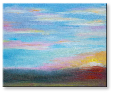
Late Summer Sunset (25-minute sketch)

Last night’s sunset was one of those where I look at the sky and say, “Ooh, I must capture those colors!”

And then, five minutes later, the colors were even better, and then better, and so on… for the next 20 minutes.  The hues were constantly changing, and I was right there, with a paintbrush in one hand and my camera in the other.

This oil sketch is small. It’s about 8″ x 10″ on canvasboard.  In real life, I think it’s prettier than it looks in the photo.  That’s how it should be; the actual work should have an energy that doesn’t quite convey in two dimensions.

Recently, I’ve learned to make the sky the biggest part of these paintings.  It’s a landscape, not a peeking-through-the-window-scape.

I’m using more greys to contrast with where the lights and highest-keyed colors are.  And, I’m working with a lighter brush (less paint) and softening the edges so it’s not one step away from fingerpaint.  (Yes, I’m being harsh, but by being somewhat hyperbolic, I can explain exactly what I’m trying to move away from, as well as what I’d like to achieve as my art improves.)

I’m not 100% sure this is finished, but it’s close enough to post online.  Really, I can hardly believe it’s been nearly a year since I’ve had something worth showing at this website.

Well, it’s been a year of big changes, and lots of accomplishments, offline.

I need to complete several writing projects for October, but some days are better for art.

Yesterday and today have been art days.  This oil sketch was completed in about 25 minutes, last night, and I spent about 10 minutes on it today, tweaking it in the daylight.

In the past, many of my sketches have been a complete surprise.  There’s been a lot of, “Hmm… look at that. I wonder how I did it.”

What’s different here is that I knew exactly what I was doing.  The work wasn’t any less spontaneous, but I had a far better understanding of what I wanted to capture, and some of the best ways to do that.

Landscape Sketches – Two Directions

As I’ve been painting this week, I can see my sketches moving in two directions.

The first is capturing the colors as a background for a later work.  My current thoughts are to combine the New England landscape colors with a tropical element.  I have a few ideas for this, but experimenting is ahead.

Sunset oil sketch - NH - Nov 2011

This week’s small sketches were a sort of dichotomy… contrasts and similarities between natural elements from very different locations.

This sketch was painted in New Hampshire as the snow from the Halloween 2011 blizzard was beginning to melt.

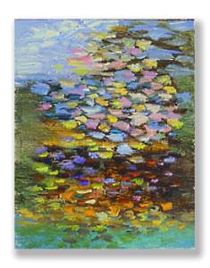
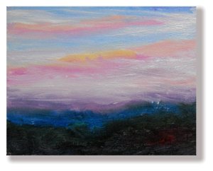
Shimmery sunset - oil painting - 4 nov 2011The second sketch (shown at the top of this post) – also 8″ x 10″ – is a direction I’m even more enthusiastic about.  Simply, I’m realizing that it’s good to push myself into Impressionism.  By choosing scenes that I can’t possibly capture realistically, I’m rushed into conveying with color… and only color.

This sketch (at left) shows the impression of the sunset, seen through a thick cluster of trees.

Though there are limits to this, I have the feeling it’s going to take me in interesting new directions.  After a few more of these (see the last sketches I posted in my April Art 2011 post), I’m eager to work much larger and with more clearly planned designs.

Note: Until I upgrade my new computer’s Win7 system so I can use my older version of Adobe Photoshop, I’m working with Paint.net.

In general, the latter program is good enough for my online work.  Alas, it’s not great for posting my paintings with correct colors.  But… it’s good enough.  I think you can get the general idea of what I’m doing.

I’m rather pleased that, after a few months of being mostly away from my easel, I’m still in this painting mode.  I think of it as swatches of color, which form the general impression of the sunset colors I’m seeing from my living room window.

White Mountains Painting – Final version

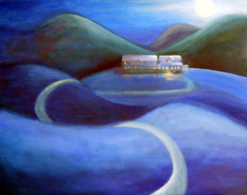
Yaayyy! I’ve completed White Mountains painting.

(If your monitor is like mine, the actual painting is about 30% darker than this photo appears.  It’s not quite so “New England quaint” as this picture may look.)

I started this painting of the New Hampshire landscape – focusing on a Whitefield, NH, hotel – in February 2010.

The painting been through several incarnations.

This week – 17 March 2011 – I completed this painting and I’m (finally!)  pleased with it.

The recent tweaks & changes made it “just right” for me.  Those changes included lightening the roof and adding more lit windows.

I’d tried a dark roof – figuring (logically) that it’d be in shadow, opposite the light of the moon – but the entire building seemed to get lost.

No matter what I did with the lights in the windows, or how much detail I added (in contrast with the deliberately simple landscape around it), nothing made the hotel stand out.

Changing the tone of the roof – from dark to light– helped right away.

Then, I experimented with the windows.  I wanted the hotel to look welcoming but not quite full.

In addition, I wanted the hotel to look very cozy and home-like… but also have that slightly other-world ambience that’s part of the Spalding Inn’s charm.

Now this 24″ x 30″ oil painting is on my living room wall, drying.

Taking this painting through its many stages has reminded me of the dance that artists do:  We immerse ourselves in the rich emotions of the creative process, and then we step back to coolly evaluate the work in progress.

That balance is key.  Unless the emotional content is there, the art can be vapid, no matter how great the artist’s technical expertise.

However, unless the artist can remove him- or herself from that emotional investment, at least enough to see what’s working and what isn’t, the painting won’t reach its full potential.

Last night, I felt that the painting was probably completed. This morning, when I looked at it again… yes, I’m happy with it now.

A somewhat dark follow-up

PaintbrushesRe-reading this post, I see I was treating part of this story lightly, because it’s personal.
However, I’ve realized that it’s also an important part of the story of this painting.

The problem is, it’s not necessarily a happy story, so you may want to skip it altogether.

Okay, if you don’t mind stories about grieving and solace, here it is…

The day my mom passed away – on April 19th, 2010 – all I could think about was getting in the car and driving somewhere that would keep me above the grief and sense of loss.

I knew that my mother would not want me to spend the day crying; she was like that, about death.

So, with my (adult) daughter who was visiting me, I got into the car and drove to Whitefield (NH) and the Spalding Inn.

In New Hampshire’s White Mountains, that town is literally above the troubles of daily life.

Also, I’m among the second generation (in my family) to spend time at the Spalding. Maybe that’s why I felt drawn to it, that day.

Or maybe it’s because the hotel’s fresh air and magnificent views connect me with Nature.  The underlying rhythms of everyday life – the “Circle of Life” perhaps – make more sense to me in that context.

Everything seems right with the world.

Whatever the reason, the Spalding gave me a sense of serenity last April.

It was a “destination,” as I’ve suggested in my concept for this painting. I’m not sure why reaching a destination seemed to lend necessary closure to the moment, but it did.

I completed this painting nearly a year later, in March. That was the week of my mother’s birthday. And that made perfect sense.

Imagination and Reality – Anasazi Scene

Last summer, I suddenly had a clear vision of a painting that I knew I was supposed to create for an online friend in Colorado.  The vision was partly realistic and partly a fantasy mix.

(Now and then, I get an idea for art that seems — from the start — to be intended for a particular person.  I know how odd that sounds, but it’s part of the intuitive process of being an artist.)

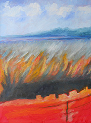
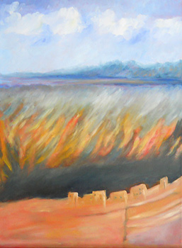
The nearly-completed painting is at left.

It’s an unusual work for me, but it’s rapidly approaching the picture in my head… the one I started with with.

The process began by collecting photos and making thumbnail sketches to put the ideas together.

Since I have never seen the Anasazi dwellings in America’s Southwest, I needed to do considerable research online and at the public library.  I was amazed at how few photos matched the images I was looking for.

However, looking for reference photos when the picture is clear in my mind… well, it’s like shopping for clothes when I have a very definite (fantasy) mental picture of what I want.

In other words, the process can be frustrating.

In this case, since I knew that the picture in my mind wasn’t actually going to match the real Anasazi landscape… well, I wasn’t sure where I was going with the work.

I guess the closest description might be the process artists use when painting science fiction illustrations.  Though we often use real, Earth-based images as points of reference, the finished work strikes out in a new direction.

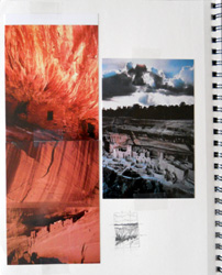
Artist's journal references for an Anasazi-related paintingAt right: A page from my artist’s journal, collecting reference photos.
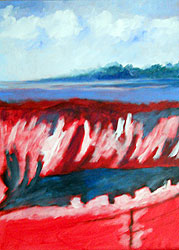
I knew that I wanted sky, trees, and a plateau.  Beneath that, I wanted some vivid, flame-like textured strokes.  The upper left photo from my journal was my reference for them. (That’s a picture by Stephen Trainor.)

Beneath that, I wanted the Anasazi dwellings, half-sheltered beneath an overhang.

Finally, I wanted a smooth rock face and some colors referencing the scene at the top.

All in all, I get the idea that it’s supposed to look a little like a Hollow Earth scene.

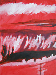
Here’s the painting process, and I continue to work with a tonal, acrylic underpainting.

The first photo shows the initial tonal notes in midnight blue and white.

After that layer dried, I started painting with oil paints.  The sky and plateau area were first, with some tonal corrections in the shadows lower in the painting.

Note: As I’m looking at this photo of the partially-completed work, I think I may re-introduce more blue into the shadows.  I’d grey’d them with ochre (a yellowy, muddy brown) and I think I prefer the blue… but I’m not sure yet.

After the upper landscape looked good, I was ready to work on the cliff-side colors, shown in the next photo.

At this point, it’s time to put the canvas aside and look at it, fresh, in a week or so.

I’m not sure what will happen with it, next, but I’m pleased with the results so far.

The original is an 18″ x 24″ oil painting on canvas.  This isn’t a commissioned work (I don’t work on commission), but it’s one that has been a fairly clear creative vision for a very definite recipient.  I’m painting it intuitively because that seems like the right thing to do.

For me, this isn’t a unique process, but it is fairly unusual.