Lake Winnisquam Sunrise – Triptych

This triptych has a history. Its current subject – Lake Winnisquam at dawn – was not its first incarnation.

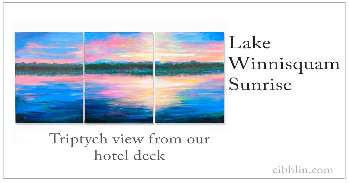
Before I share the full story, covering several months, here’s a photo of the finished work. It’s an acrylic painting, and each of the three canvases is about 18″ x 24″.
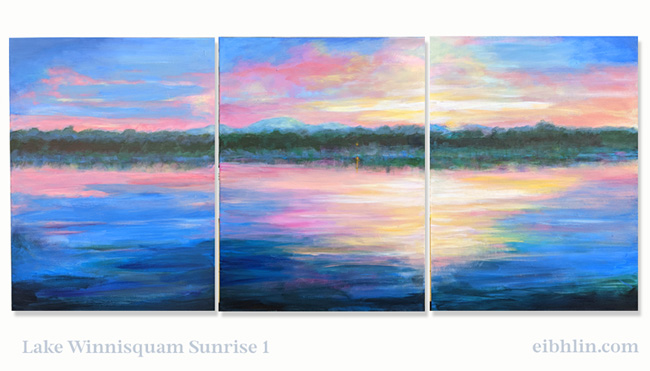
Lake Winnisquam Sunrise 1 - by eibhlin - three ~18" x 24" canvases

Here’s my original photo from Oct 2014, when we stayed in a hotel. Our “room” was actually a cabin by the lake, one of several on the property.

Each morning, I’d go outside and take photos from the dock next to our cabin.
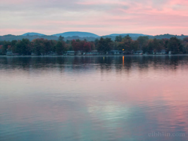
This photo still inspires me.

For this particular triptych, I wanted slightly more vivid colors, but a similar sense of calm, beauty, and peace.

The first attempt – the full-sized acrylic sketch

First, I sketched-in the general composition. I started with somewhat exaggerated colors and contrasts. (And I increased saturation in the printed photo I was working from.)

That helped me analyze the composition, color choices, and effects.

Here’s how it looked on 7 Jan 2021.
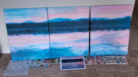
Acrylic sketch of Winnisquam Sunrise triptych

After the paint dried, I kept looking at it. It was okay, but… for me, not great. It was too literal in some ways, and didn’t convey the impression of light that I wanted.

Whenever I’m working on a painting, I study it to see what works and what doesn’t.

I notice what attracts my attention, and if that’s what I had in mind as I envisioned the piece.

Over the next eight months, this Winnisquam triptych went through many changes, similar to my painting for the Huntsville wedding.

Secrets under the paint…

To be honest, the now-finished Winnisquam scene is layered over three other triptych paintings… ones I didn’t like well enough to keep. (If I don’t like a painting, I won’t keep it around me.)

Two of the previous works were semi-abstract landscapes.

The third was a quirky, mixed media exercise in humor. I painted the canvases blue – from sky to ocean – and then glued slightly absurd Victorian images on the canvases.

I liked the idea (and my husband loved it) enough to keep one canvas from that experiment. That’s it, below. It’s now in our kitchen. My husband thinks we need to add speech balloons to it… with the critters saying ridiculous things, of course.
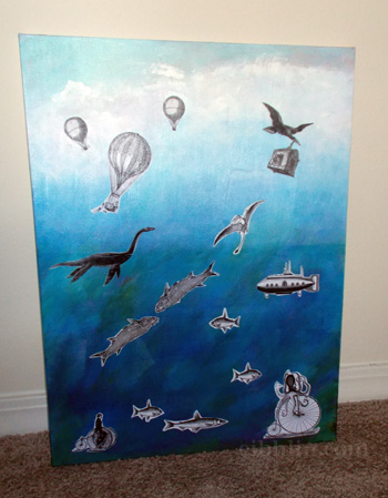
Mixed media painting - absurd from sky to sea

So then, before sketching the Lake Winnisquam scene, I replaced the now-in-the-kitchen canvas with a fresh, blank one. (This means two of the three canvases have some texture left from earlier paintings… but it’s not too obvious.)

More attempts and brighter colors

After the initial Winnisquam sketch, I tried other approaches to that sunrise scene. They didn’t work. Not for me, anyway. (I don’t think I took any photos of the results.)

Maybe it was a reflection (no pun intended) of how disappointing 2020 was, but nothing seemed quite right as I kept working on the canvases.

So, I stopped painting.

Then – I guess it was August or September 2021 – I decided to make changes. Quit waiting for… I’m not sure what.

I started to shift my focus back to my art.

That’s why, in the next phase of the Lake Winnisquam triptych (below), I highlighted the colors of the sky and the water. And then I drew (with pencil) the general area where the land – trees and mountains – should be.
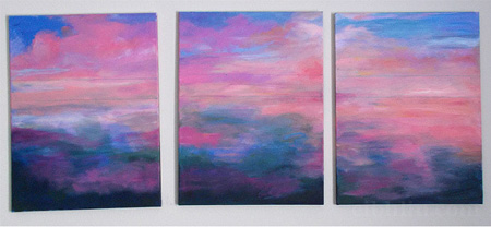
Colors of the Lake Winnisquam sky & water

As I kept working on it, the triptych looked like this, and it was pretty… but still… kind of “meh.”
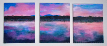
This time, I wasn’t going to quit. I went back to basics – color and value studies.

Finding answers in 8″ x 10″ sketches

First, I tried some small (8″ x 10″) acrylic sketches on canvas board, to see what would emerge.

For starters, I altered the colors.

I kind of love the blue-green and pink in this sketch, but I wasn’t convinced it’d work as a triptych. (I may change my mind and use this for a large painting, later. I really do love the colors.)
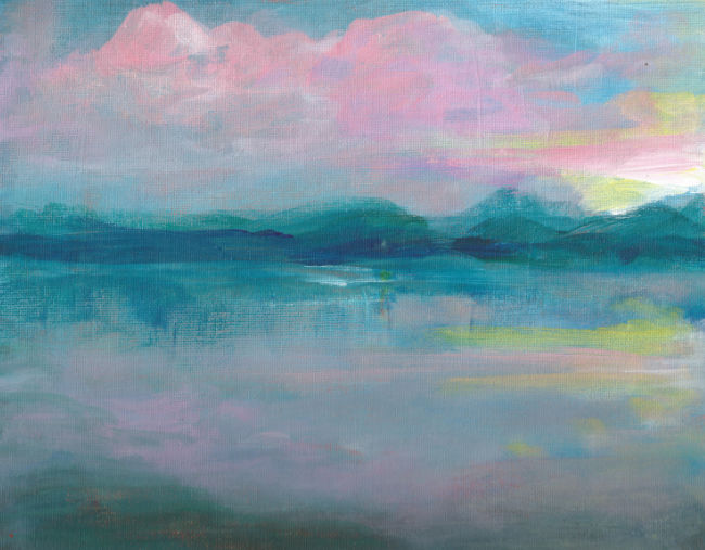
First 8x10 acrylic sketch, testing different colors

Next, I did a more literal sketch from my original photo.

Again, it was nice, and this may later become a full-sized painting.

For the triptych… No, it wasn’t quite the light and energy I wanted in my living room.
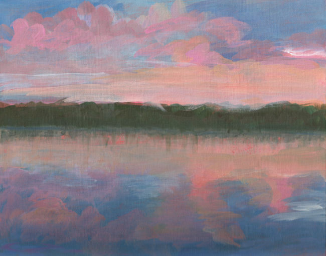
Lake Winnisquam Sketch #2

Since these acrylic color studies weren’t solving my dilemma, it was time to do some value (light and dark) pencil sketches on paper. And then I simplified the composition.
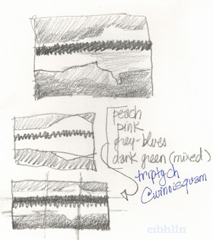
Value sketches for Lake Winnisquam sunrise painting

After that, I did yet another acrylic sketch on a small canvas board (8″ x 10″), based on my final value study/sketch – and it worked.

I kind of love the results, and may paint a larger, semi-abstract version (almost exactly like this), soon.
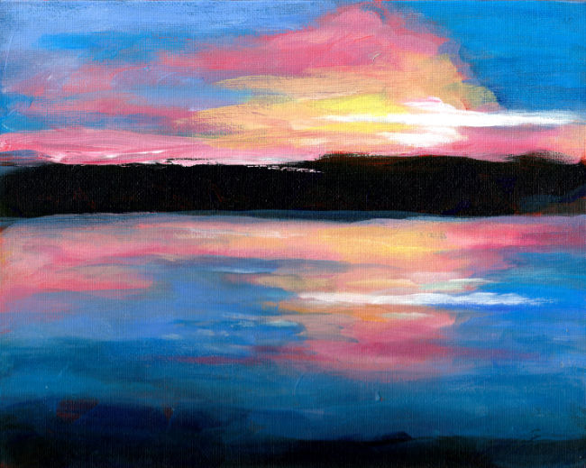
Final sketch for the Lake Winnisquam triptych edits

So, at long last, I saw exactly what to improve.

Two days later, the triptych was completed.

Here it is again, so you can compare it with the final acrylic (value-based) sketch, immediately above this.

Winnisquam Sunrise triptych - finished Oct 2021 by eibhlin

I’m very pleased with this painting. It brings light and color and energy to our living room. I smile every time I look at it.

And, of course, it’s a happy reminder of a truly spectacular month in a cabin by Lake Winnisquam, in October 2014.

 

Huntsville Wedding Painting

Like much of my artwork, this Huntsville painting has a story.

It started with a wedding invitation. I hadn’t expected it, but I was flattered. I hadn’t seen the groom since he was a toddler, and I’d never met the bride.

Though I’d never been to the area where the wedding would take place, I felt inspired to paint the couple a wedding gift: A landscape showing where the couple would exchange vows.

At that point, I wasn’t sure I was actually going to the wedding. When I’m not painting, I’m writing books & articles.

Worse, right before the holidays – starting at the first of October, if not earlier – I’m busy. Once we’re approaching Thanksgiving, I like all the work completed for the year, and everything business-y on auto-pilot.

But, I usually enjoy weddings. In addition, years ago I’d made a promise to my mother – a message she wanted me to deliver – and I was certain to see the person at the wedding.

So, with help from my brother, who lives in Alabama, I gathered visual references. Then, I found the perfect canvas.  It’s 36″ x 36″ and a nice, deep gallery wrap. (That means the canvas wraps around the edges. No frame is needed. In fact, it shouldn’t be framed.)

Finally, I was ready to sketch.

Huntsville wedding sketch 1
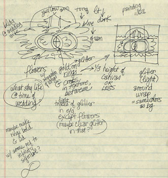
First conceptual sketch

The first sketch (at right) was grandiose and impractical. Flowers, trees, interlocking gold rings, a Christian cross in the center, and the outdoor building where they were marrying… Oh, it was fun, but I was trying to do too much with the concept.

The basics…? I knew that I wanted certain colors, including lots of shades of green (for the outdoor setting), and pink & blue flowers. I wanted to include the wedding pavilion. Visually, a circular flow would suggest wedding bands, the circle of life, eternity, and so on.

But, as I studied reference photos, I saw even more flaws in my original idea. Photos showed there was no way the sun could be visible behind the wedding pavilion. (Another building was in back of it.)

Unwilling to abandon my initial idea, I sketched the design (in pencil) on the canvas.

Almost immediately, the wedding rings and cross looked odd. Not like wedding rings.  And, in general, the mish-mash seemed a little too “cutesy.”

So, I went back to the drawing board. Literally.

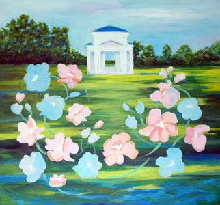
Second sketch- Huntsville wedding
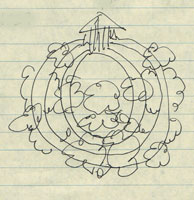
Second sketch

The second sketch (at left) was more successful.

I envisioned the wedding pavilion against a pale blue sky. The foreground would be green and blue, with a Monet vibe.

I wanted bold, Matisse-y flowers, connected with two concentric, gold rings. The latter would be in metallic gold paint, possibly with glittery highlights.

Happy, I ordered the imported paints & brushes I’d need.

While I waited for them to arrive by mail, I started the underpainting. (An underpainting rarely shows through, but it can make the colors “pop” more.)

Huntsville wedding - underpainting
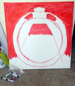
My initial underpainting

From my mother (also an artist), I’d learned to study the handwritten notes of my favorite artists. So, based on Monet’s notes, the first layer was cadmium red.

That’s it on the right. I roughed-in the roof of the wedding site and left it white. Then, I underpainted the sky and greenest areas, the concentric circles, plus some central design elements.

So far, so good.

When the paints arrived, I sketched-in the general colors and themes: the sky and grassy area, the building, the rings, and some big white splotches where the flowers would go. I also painted the wrap (the sides of the stretched canvas) to match. It looked good.

I wish I’d photographed the steps that followed, but… I didn’t. The paints arrived late, and I was working day & night to complete the painting on time.

This was about two weeks’ work, and yes, I have enough art experience to work quickly, especially when I’m in “woman on a mission” mode.

I propped the Huntsville painting where I could see it when I was in the kitchen. I moved it so I could study it while eating meals. I turned it so I could glance at it while catching up on news, etc., on the TV.

I kept painting & tweaking, and painting & tweaking.

I didn’t sleep much. That’s because, as the deadline approached, it was better to complete the painting and have peace of mind, than to toss & turn, fretting over this.

Finally, I visited a couple of art supply stores to find the perfect gold (and glitter accents) for the wedding rings.

But, when I painted those rings, they looked weird. Sort of like a bulls-eye design. Sort of like a time tunnel, or how Hitchcock had represented hypnosis or a dream state.

Loosely painted flowers & stems
As I worked on the flower colors, a problem emerged.

Nope. That wasn’t going to work. So, I painted over all the gold & glitter, and worked on the flowers while I thought about it. (That stage is at left.)

After suggesting the flower colors, I added loose, swinging flower stems to create the circular flow I had in mind. They’re fun.

That’s when I saw a balance issue. My attention was drawn to the dark, literal greenery in the upper left corner. The effect was jarring against the whimsical style of the flowers.

So, I repainted the greenery.

Note: Yes, the floral design does fill more of the left than the right. That’s a deliberate choice.

In illustration and in painting, the eye tends to go from left to right.  If you want a happy, uplifting mode, keep the right side as open as possible. Nothing should make the eye come to a halt. The right side of the canvas should suggest cheerful, forward energy.

(By contrast, if you want to represent something sinister, put lots of big, blocking images on the right side of the artwork. If they’re powerful enough, you might even see a physical reaction when someone looks at the piece.)

At this point, I was starting to like my Huntsville painting again. That was a relief. In my experience, any art that doesn’t go through the “oh dear heaven, this is ugly” phase during the process… it’ll hit that point at the end.

It’s better to go through the rough part around the middle of the process. (It’s like that with my writing too. Many writers describe the “awful swampy middle” of their stories. You either persist or you give up; that can be the difference between a successful writer/artist and one that never seems to finish anything.)

And, from that point forward, everything came together.

Nearly finished, except for a horizon issue.

On Thursday night (before starting our journey on Friday), I thought the painting was completed. I loved it! Of course, I photographed it to show my oldest daughter. (That’s the photo, on the right.)

In that smaller size – and with a fresh way of looking at the finished work – I could see that the horizon was completely wrong. Comparing the left, right, and inside the wedding building… it didn’t line up at all.

So, after a late-dinner break, I returned to the canvas and repainted portions of it. Now I really liked it.

And, I knew it was almost complete.

At that point, I added a small red dot in “Chinese red” (my mother’s term for a bright, rich red-orange hue). That was one of my mother’s signature elements in many of her paintings. She felt that the energy of a red dot attracted the eye on a subtle level, and – correctly placed -it could balance any painting.

Since this is a family gift, it seemed important to include that nod to my mother. Without her love and encouragement, I might not have become an artist.

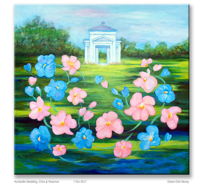
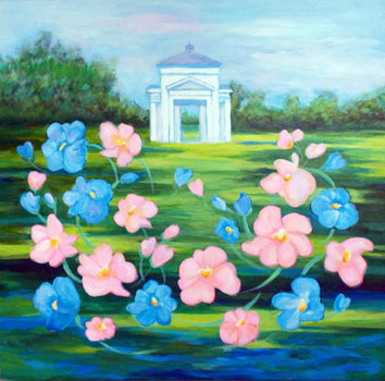
The finished  painting is at the top of this page. You can click on the image to see it slightly larger.

We hand-delivered it (after a 14+ hour drive) to the happy couple – Chris & Shannon – in Huntsville, Alabama. I’m proud of this painting, and feel that my mother had some input, at least as an inspiration.

And, I think she’d be proud of this, and happy for the newlyweds.

Winnisquam Sunrise

Today, the light is dismal.  It’s grey, flat, and rainy.  Even sitting next to the floor-to-ceiling window on the “sunny” side of our living room, everything looks pretty blah.

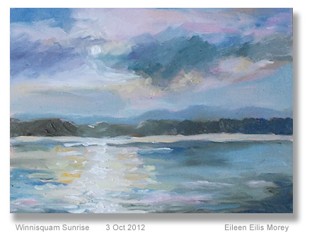
To test a painting technique recommended by Peter Wileman (see review, below), I chose a photo I’d taken, earlier this summer.   It’s lovely, and I may get prints made from it, to sell at a local shop.

I did the b&w sketch like Wileman does. Then I did a small sketch in colored pencils.

Finally, I created the oil sketch in the photo. It’s 9″ x 12″ on canvas board.

I’m astonished.  It’s a genuinely good painting, even though it loses a lot in this photo.  (As I said, the light is terrible today.)

Yes, this does look a little like my mother’s work.

I loved many of her paintings, but some were too rote for my liking… and hers.

She swore it was the time spent at Mass. Art, where everything had to be sketched as cubed, spheres, and cones, first.  Then, they were allowed to build their work on top of those geometric forms.

That’s one reason Mum was firm about me not going to art school.

She felt that the training had curbed a lot of her originality.

I spent about an hour on this piece, and I’m not sure if it’s finished yet.  I may see something that I’ll want to change, tomorrow.  Or, I may wait until we have a good sunny day – the weather forecast looks good for Friday – so I can better judge the colors.

Anyway, mimicking some of  Wileman’s style was a good experience.  I know I’ll integrate some of this in future paintings.

And, honestly, for a painting that took me an hour on a dreary day, I’m pleased with the results… more than I expected to be.

Wileman review

Yesterday, I watched Peter Wileman’s full-length video, Painting the Light in Oils.

Here’s a clip from it:

My initial reaction was, “Okay, I learned a few things from watching him work, but I’m more interested in how he created those small, early sketches, not the finished works from them.”

The video introduction was very good.  I was interested in his color choices and the brushes he uses.  I’m going to try using MDF as a support, too.  Seeing the difference between his work on MDF and on canvas… that was impressive.  MDF won, hands down.

The five paintings he completes during the video are mostly watching him paint, with occasional references to what he’s doing.

If you haven’t seen a lot of people paint, or you haven’t completed a bazillion paintings yourself, I’m not sure there’s much to learn from this video.

The book of the same name provided a little more information, but – all in all – I wasn’t very impressed.

His paintings are lovely.  His use of color is interesting and more courageous than I usually am.  He captures light beautifully in his work.

That’s what I wanted to learn more about.

His style… I’m not so sure.

But, I’ve decided to try something from each art book and video I study, just to see what happens.

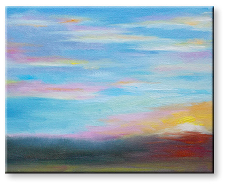
Late Summer Sunset (25-minute sketch)

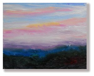
Last night’s sunset was one of those where I look at the sky and say, “Ooh, I must capture those colors!”

And then, five minutes later, the colors were even better, and then better, and so on… for the next 20 minutes.  The hues were constantly changing, and I was right there, with a paintbrush in one hand and my camera in the other.

This oil sketch is small. It’s about 8″ x 10″ on canvasboard.  In real life, I think it’s prettier than it looks in the photo.  That’s how it should be; the actual work should have an energy that doesn’t quite convey in two dimensions.

Recently, I’ve learned to make the sky the biggest part of these paintings.  It’s a landscape, not a peeking-through-the-window-scape.

I’m using more greys to contrast with where the lights and highest-keyed colors are.  And, I’m working with a lighter brush (less paint) and softening the edges so it’s not one step away from fingerpaint.  (Yes, I’m being harsh, but by being somewhat hyperbolic, I can explain exactly what I’m trying to move away from, as well as what I’d like to achieve as my art improves.)

I’m not 100% sure this is finished, but it’s close enough to post online.  Really, I can hardly believe it’s been nearly a year since I’ve had something worth showing at this website.

Well, it’s been a year of big changes, and lots of accomplishments, offline.

I need to complete several writing projects for October, but some days are better for art.

Yesterday and today have been art days.  This oil sketch was completed in about 25 minutes, last night, and I spent about 10 minutes on it today, tweaking it in the daylight.

In the past, many of my sketches have been a complete surprise.  There’s been a lot of, “Hmm… look at that. I wonder how I did it.”

What’s different here is that I knew exactly what I was doing.  The work wasn’t any less spontaneous, but I had a far better understanding of what I wanted to capture, and some of the best ways to do that.

Landscape Sketches – Two Directions

As I’ve been painting this week, I can see my sketches moving in two directions.

The first is capturing the colors as a background for a later work.  My current thoughts are to combine the New England landscape colors with a tropical element.  I have a few ideas for this, but experimenting is ahead.

Sunset oil sketch - NH - Nov 2011

This week’s small sketches were a sort of dichotomy… contrasts and similarities between natural elements from very different locations.

This sketch was painted in New Hampshire as the snow from the Halloween 2011 blizzard was beginning to melt.

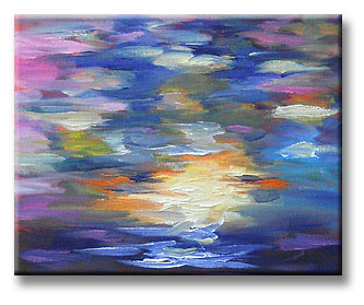
Shimmery sunset - oil painting - 4 nov 2011The second sketch (shown at the top of this post) – also 8″ x 10″ – is a direction I’m even more enthusiastic about.  Simply, I’m realizing that it’s good to push myself into Impressionism.  By choosing scenes that I can’t possibly capture realistically, I’m rushed into conveying with color… and only color.

This sketch (at left) shows the impression of the sunset, seen through a thick cluster of trees.

Though there are limits to this, I have the feeling it’s going to take me in interesting new directions.  After a few more of these (see the last sketches I posted in my April Art 2011 post), I’m eager to work much larger and with more clearly planned designs.

Note: Until I upgrade my new computer’s Win7 system so I can use my older version of Adobe Photoshop, I’m working with Paint.net.

In general, the latter program is good enough for my online work.  Alas, it’s not great for posting my paintings with correct colors.  But… it’s good enough.  I think you can get the general idea of what I’m doing.

I’m rather pleased that, after a few months of being mostly away from my easel, I’m still in this painting mode.  I think of it as swatches of color, which form the general impression of the sunset colors I’m seeing from my living room window.

April Art – 2011

It’s been awhile since I posted my recent art.  Oh, I’ve been creating art; I just haven’t had time to post it here.  It’s been a busy six weeks+.

I may talk about some of these works in more detail, later.  For now, this is a catch-up post.  A long one.

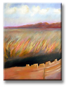
Anasazi painting - landscape for FrankI completely revised the colors in the Anasazi scene, and that painting is now ready to ship.  I like it.

Similar to my Spalding Inn painting, this isn’t in my usual style.

However, the Anasazi painting was painted from an inspiration and some photos, while the White Mountains landscape was an exercise in a deliberately different style… more  Tomie de Paola, I guess.

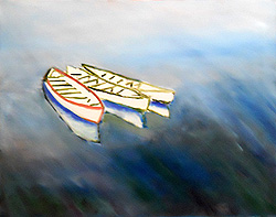
I also took out a painting that I’d started a couple of years ago, featuring three boats in the water.  I’m working from a photo that I took along coastal Maine.

3 boats in MaineInitially, the painting had a dock in it and the painting was heading in a very realistic direction.  That means it bored me out of my mind in a matter of days, so I parked the canvas in a corner in my studio.
Last month, I painted over almost all the water.  That’s how the painting looks now, at right.

It’s less than halfway completed.  For example, the boats are just a few paint strokes.  I’ll work on them more, next.

Then, I think I want the water to have a lot of variety, but… well, I’ll see when I get to that point.

Pandorica series

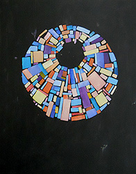
Pandorica painting #1I also experimented with some Pandorica paintings.  I’ve learned two big things:
  1. Oil paint takes far too long to dry, when working with stencils, and…
  2. Even with acrylics, this concept takes far too long to complete.

I need to do a lot more work on this painting.  Oh, it’s about 70% finished, but it needs a lot of touch-ups.

I cut the stencils myself, to get the exact level of irregularity that I wanted.  And, laying this out, I used the stencils within a bigger, circular stencil that was cut into wedges.

It was one of those things that sounded wonderfully fast & simple in my head — and terribly organized — but in reality it wasn’t fast or simple.  (However, it was very organized.)

Some of the rectangles, especially the yellow & orange-ish ones, were overpainted with interference gold. That’s a translucent, metallic paint.  Until I added that, some of the colors were far too subdued.

This painting, above on the left, will probably be the only Pandorica painting of its kind.  It’s also the only acrylic painting on this page.  It’s 16″ x 20″.

I may come up with a different approach for Pandorica-themed paintings, later, but — for now anyway — this will be a one-of-a-kind work.

Oh, I’m pleased with it, but the hours that have gone into this… wow! And, it’s not even finished yet.

Meanwhile…

Sunrises and sunsets

I’ve continued painting sunrises and sunsets as the mood strikes me.  They’ve gone through a radical change, and that fascinates me.  I’m never sure why my works turn out as they do.  It’s like they have their own energy and voice.

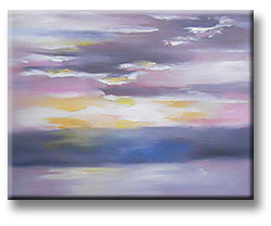
Cloud highlights - April 2011It wasn’t an overnight change, but close enough.
The first “different” painting was one where I did a lot more work with the light & shadows in the clouds.

That’s it on the left.  It’s 11″ x 14″, and the colors & style are very calm.

Perceptions series

The next painting after that… well, it’s not calm. I’m calling these my Perceptions series.  Each of them works with perceived color and with a very lyrical approach.

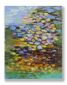
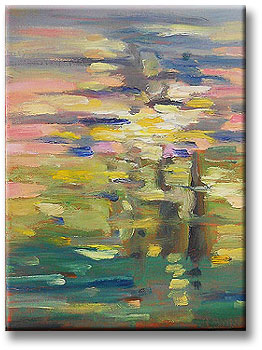
Perceptions series #1I was looking through a crop of trees, in the direction of the sunset.  The light shining through the evergreens was almost blindingly bright for awhile, and the colors of the sky were sort of all over the place… blue here, pink there, and so on.

All in all, it looked like a crazy quilt of colors peering through the tree branches.  So, that’s exactly what I painted.

It’s oil paint on 8″ x 10″ canvasboard.

Perceptions #2 - 6 may 2011A few days later, another interesting sunset caught my attention. Same crop of trees, and same crazy-quilt effect.  However, I was especially intrigued by the different shades of green.
Amid the trees, the colors seemed very yellow-green.  At the foot of them, everything was far bluer and more veridian green.

This one has such odd colors, it was particularly difficult to photograph accurately.

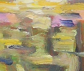
What really makes these paintings are the brushstrokes and thick paint.  I’m using soft, sable brushes, and they really lay the paint on in thick, juicy globs.  The whole thing is very sensual.

Perceptions 2 - detailAt right, you can see a full-sized section of the canvas, and it shows the texture of the paint I’m using.
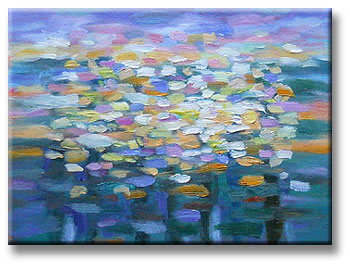
There’s an interesting balance of urgency and serenity in these paintings.

I like them.  They’re odd, but I like them anyway.

So, last night I tried a more organized approach to these kinds of works.  (It’s a Virgo thing, I’m sure!)

The sunset was lovely, and the colors were once again all over the place.

Perceptions #3 - 9 May 2011However, that simpler & more organized approach was far too left-brained.  The painting ended up taking over an hour… for a 9″ x 12″ sketch on canvas.  So, I won’t do that again; I’ll go back to my impressionistic/urgent approach, just glopping paint here & there to mimic the wild range of colors outside my window.

(Yes, I’m still calling them “sketches” though they’re finished paintings.  I plan to use them as studies for much larger works based on the same concepts.)

So, those are my paintings for the past six weeks or so.  Not a whole lot of them, but I’m pleased with the results.

And really, I can hardly wait to see where I go with this new patchwork & perceptions approach to my work.