 Before renewing my love affair with pen & ink illustration, I needed a new rapidograph.
Since childhood, I’ve always loved black-and-white illustration, and my drawings are a mix of contour-style line drawings accented with cross-hatch (etc.) shadows.
My “people” have always been silly-looking things with large noses that often extend directly from the hairline and either amused or perplexed expressions.
When I first stumbled onto illustrations by Edward Gorey, I knew I’d found a kindred spirit. Though his writing themes are far darker than mine, I got his artwork. I’d filled notebooks with similar drawings; they were created during high school study halls when others were either working on homework or passing notes.
Though I used a traditional crow quill pen (and ink well) during my teen years, I discovered rapidographs once I went to college.
Today, they’re sometimes called rapido sketch technical pens and I’m currently using a Size 0 (zero) point.
My newest ATCs
As I was breaking-in my new pen, I wanted to create a series of ATCs. (Artist Trading Cards are usually 3.5″ x 2.5″ mini-works of art.)
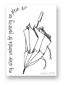
The first was a drawing of my painting umbrella, shown above. The umbrella has a silver top and vents to keep me cool when I’m painting outdoors on summer days. The lining is black, so reflected light doesn’t affect the color of my work.
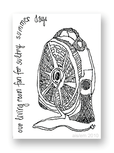 The next ATC was a sketch of our living room fan, shown on the left.
We keep this fan by the patio door, to bring in cooler breezes when summer days are a little too warm… but not hot enough to use the a/c.
The tricky part of sketches like these is knowing how much detail to include and what to leave out.
I’m not sure I got it right with this card, but these were just for practice, anyway.
In retrospect, I probably wouldn’t do so much cross-hatch style shading on the fan’s support. However, that exercise helped me with a later card, and I try not to get stuck in making everything just so.
Perfection is one of those traps for me as an artist. If I get bogged down trying to improve my work to an unachievable standard, well, I stop making art after a while. So, I try to remember what’s “good enough” when I’m working.
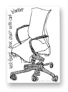 The next ATC in the series was a little trickier, at least in perspective and detailing. It’s my husband’s desk chair.
When he’s not sitting in the chair, he leaves a folded piece of flannel fabric on the seat. That’s to provide a softer surface for our cat, George, to sit on and to keep some of the cat hair off the chair.
So, I was once again faced with the question: How much detail should I include? The flannel is plaid and has ragged edges; I left out the former and included the latter.
The sketch isn’t perfect (ah, that word again!), but it’s good enough.
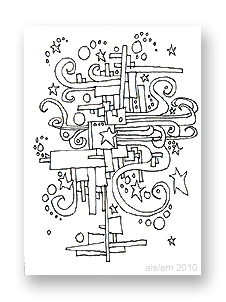 My next ATC was based on one of my favorite scribbles from junior high school and later. I used to draw these in the margins while taking notes in boring classes.
Though some elements are reminiscent of Peter Max’s art, I drew these before he became popular. Several artists of that era drew from popular and iconic 1960s art and illustration.
In some cases, I’d color these kinds of drawings.
One eventually became a huge work of art that decorated three walls in an elevator of a Marlborough Street apartment in Boston, Massachusetts.
Later, one became a massive mural for an office just outside Salt Lake City, Utah. It could be seen from the street through a huge plate-glass window. I was tremendously proud of it.
Both were full-color paintings, usually featuring vivid crayon-box colors.
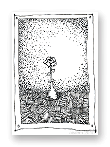 My next ATC is a nod to my high school art teacher, Roger Mulford.
One of my best friends (and classmates), Laura Whipple, and I both drew flowers for a class assignment. Like me, Laura favored pen-and-ink drawings with lots of detail and sometimes “dotty” shadowing.
Roger called it the Morey-Whipple (or Whipple-Morey) style of art. We thought the name was pretty funny.
(Roger had always been a somewhat renegade teacher, insisting that we call him by his first name. When the school insisted that he had to be “Mr. Mulford,” he retaliated by calling us “Miss” and “Mr.” with our surnames, so we were still all on equal footing.)
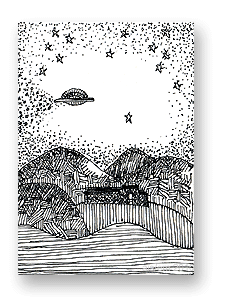 My final ATC in this series was a moment of whimsy. It represents the skies over Whitefield, NH.
The Inn is on the general path described by Betty and Barney Hill, the first Americans to report an alien abduction.
They talked about the route the UFO followed, over their heads as they drove south on Route 3 from the Canadian border to around Exit 33 (off Rte. 93) where they were abducted.
The UFO overhead may not be realistic, but… well, it’s fun.
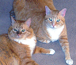
And, for animal lovers, here’s our cat, George. He’s the one on the left. His brother, Tom, is on the right.
