Painting Moonlight in the Sunlight

After several days of clouds, rain, and a little sleet, the sun was shining today. That meant great natural light for painting… wonderful!

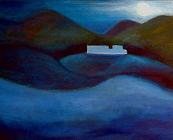
I’ve been itching to get back to this moonlit landscape. It’s at the point where I’m working on details, and that means paint a little, and wait for it to dry. Then I can paint a little more, and wait again for the paint to dry.

Depending on the amount of white paint in the work, that can take a week, two weeks, or even three. (White paint is the slowest to dry, and since I’m building up layers of paint, thicker paint can take forever to dry.)

So, whenever there’s sunlight and the canvas can be worked on, this is a really exciting part of any painting.

It’s a lot like writing a novel.  The beginning is energizing.  The conclusion is exciting, to see how all the elements come together.

The middle phase… it’s often an emotional slump, and it can be filled with trial-and-error experiments.  Trying to rush that part is natural, and one of the worst possible things you can do.

There are times when a painting will sit in that phase for months.

Right now, I can see a canvas leaning against the wall.  It’s huge — about four feet wide and three feet tall — and it’s been in that middle slump for over a year.  It’s difficult not to look at it as a failure trophy.  (I talked about that in December.)

However, I’m not rushing it; if I did, I might lose the spark that it has.  At some point, I know I will look at the canvas and say, “Ah-HA! Now I see what it needs.”

That’s exactly what happened this past week, as I looked at two paintings that I thought were completed, but they never really had the sparkle I like in my work.  Now, I know that they will.  (Each requires the same very minor tweak.  I’ll post photos here, when I work on them.)

Most of my paintings are completed within two or three months.  However, some of my work – if I’m patient with it – can take longer and still turn out really well.

This painting – the moonlit one – is more typical.  It’s taken a couple of months from start to finish.

I struggled with it a little, immediately after roughing-in the general light and dark areas.  Then, it’s like it took off.  I was in flow with it, and everything since then has been like the downhill side of the roller coaster:  Fun, fun, fun!
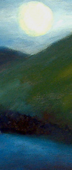
This painting – of the White Mountains region near Whitefield, NH – is at the completion phase.  It’s exciting. I can hardly wait to see what the next layer of paint will add, and how much more it will come alive.

Today, I outlined the building (a local hotel, the Spalding Inn) more clearly, so it has its distinctive shape.

I also added more light around the moon, and darkened the far left part of the sky; that distinguishes the scene as a moonlit scene, not a daytime scene.

(In the detail at left, it might be difficult to tell.)

I evened-out the tone in some areas, so some of the mountains sort of blend into the darkness.

All in all, this was a really good day of painting.  I’m pleased, and I know this painting is within a few days (painting days, that is) of completion.

This is when I get really excited about my work.  It’s taken on a life of its own, in a way.  It has its own energy, and I can hardly wait to see how it turns out!

Spring is on the way – Color study

I’m ambivalent about spring.  Oh, I love the warmer weather.  New England winters are lovely to look at… through a window! The other three seasons are among the reasons that we live here.

Anyway, as an artist, I’ve noticed that winter and summer are when the clouds are most dramatic at sunrise.

As spring approaches, the skies are more… well, suited to watercolor.  (That’d be fine, except that I’m not suited to watercolor.  I’ve taken endless classes, and… nope, that’s not a medium that flows — no pun intended — for me.)

So, I cross my fingers each day, hoping to see delicious clouds and juicy contrasts as the sun comes up.  That’s when I’m likely to paint more oil sketches from my living room window.

However, I’m realizing that we’re moving out of that time of year.

Oh, I’m pleased with this morning’s color study.  (A detail from it is below, on the left.)  However, I’m not seeing the vivid colors and stark light-and-dark of winter sunrises.

It’s not that I’m unhappy with the colors right now.  I’m just not as inspired by them.

The good news is, I can shift gears.  I have so many wonderful oil sketches from the past couple of weeks, I can use them as the basis of larger, semi-abstract paintings that represent those same scenes.

That is exciting!

Sunrise study - detail - NH - Eileen Morey - oil paintingsThe morning sketches served three purposes.  First, they restored the thrill of painting, and especially painting landscapes.  Second, they restored my self-confidence, that had eroded a bit over the past year.  Finally, these sketches give me the references I need to work on larger, more dramatic works.
So, though I may not continue daily oil sketches (based on the subject outside my window), I’m still painting.   Most days, I will at least work on a larger landscape, either semi-abstract or Tonalist.

When the weather turns warm enough to paint outdoors, comfortably, I’ll also be working on more plein air studies.  (That is, art created in the open air, under natural light.)

Frankly, if I’m not online, I may be on the road, driving to the seacoast or the White Mountains, to capture the sunrise colors there.

I’m excited about the warmer weather.  I’m relieved to be painting daily, again.  And, I’m looking forward to how these smaller sketches inspire larger works that help me appreciate the colors of Nature even more.

Update: In January 2011, I revisited this color study and turned it into a small gem of an oil landscape.  To view the results, see Spring 2010 – Revisited.

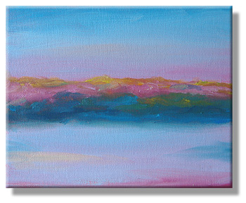
Color Study – 6 Mar 2010

It was a cloudless morning.   The colors were lovely, but I’m most inspired by the startling colors that flash across the clouds when the sun is coming up.

So, I decided to try a color study instead of anything as dramatic as my usual morning sketches.  It’s a smaller work — 8″ x 10″ — but I’m rather pleased with it anyway.

The bad news is: The sky (and local color) was so blue, this photo barely represents the work.  I’ve had that problem before, when I paint and then try to take photos as the sun is coming up.

However, we’ll be at the seacoast later today, so I won’t have a chance to take better/replacement photos.  Not today, and by tomorrow or Monday, I’ll have half-forgotten these photos and I’ll be posting new artwork.

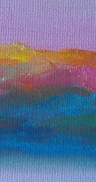
Detail of color studyThe detail at left may give you a better idea of the range of colors in this morning’s work.  That where, in real life, this color study shines.
It was one of those mornings when the sun was a rich red-orange (“red in the morning..,” as the saying goes) and for just a couple of minutes, the colors of the landscape were intense… almost neon versions of what they looked like five minutes later.

And, by noon, this scene will look as gray as any other washed-out day in early March.

That, of course, is the point of getting up early to paint.  I want to see those fleeting colors.  They’re what I keep in my mind’s eye as I look at the landscape at noon, when the light is very white, the shadows almost vanish, and the colors are flat.

To fully grasp the beauty of Nature, I think it’s vital to see it at its best.

(It’s sort of like seeing a photo of your aged grandmother from when she was dating.  After the initial “Wow!” moment, you can see how gorgeous Granny was — and still is — now that you know what to look for.  And, you probably see some of that beauty in yourself, when you look in the mirror.)

For me, Nature is at its best when the lighting is most interesting: Sunrise, sunset, immediately before a dramatic storm, during an eerie fog, and at night.

At sunrise today, I had about two or three minutes of vivid, hyper-saturated color in the landscape.  That’s what’s in this color study.

Cloudy morning – 5 Mar 2010

Since I didn’t paint at all yesterday — and really missed it — I was hoping that today’s skies would be more inspiring.  (Yesterday was one of those flat, gray-looking days.)

At sunrise this morning (6:15 a.m.), the sky was not inspiring.  However, I sat by my window and kept watching.  This process can be really tedious, because I cannot look away, even for a few seconds; I might miss an important flash of color that’d inspire a painting.

For about 20 minutes, the sky was gray and the snow looked brownish, as it does in late winter when it’s melting and the surface is dirty.

(Note:  When I like the color grey, I spell it grey. When I don’t, I choose the preferred American spelling, gray.)

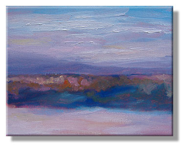
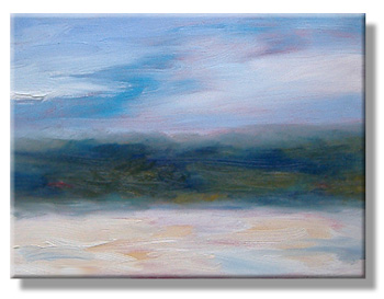
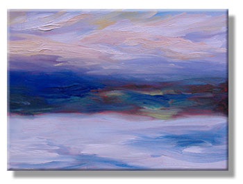
Anyway, for just a few minutes — maybe 1 1/2 minutes, total — the sky had some color.  The clouds were blue and white and lavender , with touches of pink and peach.  The snow changed from a brownish tint to something more peachy.  And, the hills in the background seemed to flash a wide range of colors, including blue, green and orange.

So, I grabbed my palette and brushes, and the resulting sketch is above.  It’s a 9″ x 12″ canvas, wrapped so the colors extend around the sides and the painting doesn’t have to be framed.  (But, I probably will frame all of these, later.)

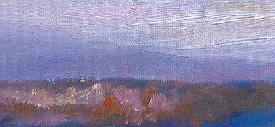
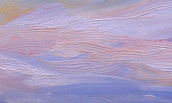
Detail of March 5th oil sketch - cloudy morning in NH - Eileen Morey, artistThis is one of those sketches that went just a little too far, and I had to backtrack quickly to recapture the original energy.  Luckily, I was successful.  (More often, it’s better to wipe the paint off the canvas — or at least the area that I’d spoiled — and try again.)
For me, it’s always a tricky balance between “just right” and tweaking something so it’s technically more precise… but the initial energy is gone.

I’m getting better at making that decision, but I’m not 100% accurate with it, yet.

At left, you can see the some details from the middle of the canvas.  The pinkish colors are where the cadmium red (underpainting) shows through.

In general, I look at this canvas, and the mood and blending remind me of William Blake.  I’m okay with that, although — as a child — I grew up looking at my mother’s books of William Blake’s work, and they seemed really dark and creepy to me.

So anyway… for the past couple of days, I’ve left cadmium orange off my palette.  I don’t miss it.  I’m not sure that I’ll continue with this limited palette, but I ‘ll see how well this works in future paintings.

The colors I used were (from left to right on my palette): French ultramarine blue, cadmium red, cadmium yellow, lemon yellow, and pthalo blue.  I also use titanium white, which looks like a long squeeze of toothpaste across the bottom of my palette.  (Alizarin was on my palette, but I didn’t need it for this painting.)

I used five brushes, and most of them were filberts (rounded tips). All were boar bristle.  (One might have been synthetic boar bristle… but the idea is the same: It’s a stiff bristle that holds a lot of paint.)

For me, the brush strokes can be an important part of the work.  That’s where I vary from many Tonalists, who often prefer a completely smooth, almost glassy-surfaced painting.

It’s also a little frustrating when I post my artwork online:  If I sharpen the image so the brush strokes are clear, the impression of the colors seems askew.  So, the online images aren’t quite what the paintings look like… but they’re close enough.

Each day, I find myself mixing more colors on the canvas.  In fact, except for mixing the grey (French ultramarine blue + cad yellow) on the palette, almost all of the colors were pure pigment on my brush, and mixed as the brush dragged across the canvas.

I feel as if I’m recovering my artistic style.  As I look back over the past year and what I was working on, I realize how much my inner artistic voice was suppressed by my efforts to please the client I was working for.

Note to aspiring art collectors: It’s as counter-productive to nag an artist as it is to nag a woman in labor.  The creative process is best when it’s internally-driven.  If you can’t not nag, buy your art at a gallery, not directly from the artist.

Oh, I’m always flattered when people ask if they can buy my paintings.  That’s not what I’m talking about.

I mean clients who think frequent nagging encourages the artist to work faster.  (It does, but the results probably won’t be inspired work.)

That said, at least 80% of my clients are wonderful to work with.  They get what’s involved in the creative process, and they understand how to encourage it.  The result is collaborative delight.

In the future, I’ll probably follow Monet’s example:  I’ll accept subscriptions at a flat, predetermined rate. Then, the clients can visit my studio on a certain day, when I’ll have more than enough paintings for each to take one painting home.  In the order that they subscribed, they’ll be able to select one painting — from my latest works — to take home.

I like that idea.  I retain my autonomy as an artist, and the clients receive work that they’ve selected.

But, for now, I’m simply painting. I’m getting back in practice, and recovering my authentic voice as a painter.  I also want to build a large enough body of work that my kids (and their children, and so on) will have an artistic legacy that represents me as an artist and as an individual.

Once I feel confident in that, I’ll think about gallery work again.

Sunset Landscape – 3 Mar 2010

Never underestimate the speed, grace or brilliance of a sunset.  I learned that yesterday.

I’d overslept in the morning, and missed the sunrise.  So, even if it was raining, I was committed to painting at sunset.  I’m eager to maintain a productive painting schedule; I feel as if I missed many opportunities in the past year, and I guess I’m making up for that now.

So, as I was setting up my easel by the window, the sky looked okay… but far from great or inspiring.

Then, just as I was choosing the paints to put on my palette, everything changed.  The sky became brilliant with pink, peach, yellow, and white, against a deep lavender horizon.

The hills below were tinged with blue and — by contrast — the greens were vivid.

All of this reflected on the snow in the foreground.

Frankly, if I hadn’t been ready when the colors turned that brilliant, I’d have missed my opportunity altogether.  The sky looked like this painting for… well, maybe 10 minutes at the most.

After that, dusk turned to night and the colors faded with the light.

So there I was, painting in the dark to finish the sketch, and hoping that the colors and brush strokes were good.  (I needed to blend two tiny areas this morning.  Otherwise, everything was better than I’d hoped.)

Sunset painting - sky detail - 3 Mar 2010 - Eileen Morey, artistAs I’m getting more practice with these oil sketches, a lot of technique is coming back to me.

My brush strokes — some of the sky is shown, at left — are less choppy.  I’m bolder with my colors.  I make more dramatic choices to capture the essence of the landscape.

I’m pleased with my work, and with my progress.

In fact, when I completed this painting last night, I said to myself, “There are days when I wonder why I do anything except paint.  This is one of them.”

This sketch may inspire a much larger version, approached as a semi-abstract.  I’m not sure.

Right now, I know that I like this painting… a lot.

Colorful Morning

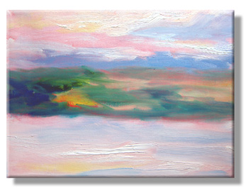
This morning, the sunrise flashed some spectacular colors… but only briefly.

Fortunately, I was poised by my window with my palette and brushes in hand.

Though snow is still on the ground, the colors of spring are emerging!

This oil sketch took about 10 minutes.  The vivid colors were visible for even less time, and I was delighted to capture them this well.

My east-facing windows provided the first tip that the colors would be juicy.

The snow looked pink, even before the sun peered over the horizon.  So, I knew to prepare a very large brush (a size 16 filbert with fairly soft and tapered boar bristles) with a mix of alizarin crimson, cadmium red and titanium white.

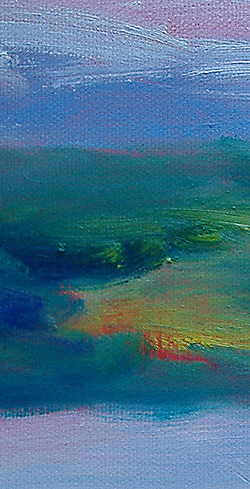
Details of an early morning oil sketch - NH - Eileen Morey, artistRight away, I scrubbed-in both the sky and the snow areas with that mixture.

Then, lavenders began to emerge on the horizon… literally.

So, I added them with a smaller brush (size 10 bright, boar bristles) and kept working at a rapid pace.

Yellows appeared next as the sun cleared the evergreens to the east.

(Remember, I’m looking westerly as I paint.  The landscape is darker on that side, and the sunlight from the east strikes it gradually.)

In the warm, yellow-saturated light, the usually muted colors of the hillside flashed a preview of spring.

I scrubbed those colors in quickly, as well.  The blues and greens were mixed with varying amounts of French ultramarine blue, pthalo blue, lemon yellow and cadmium yellow.  There’s probably a little cadmium orange in there, as well.

I stopped my work  while the energy of the painting was still vital.  Though very loosely executed, this painting conveys the almost magical (and fleeting) moods of the sunrise during just a few moments.

At that point, it was barely dawn.  I had to wait to photograph my painting in natural light, because it simply wasn’t bright enough to take a clear, crisp picture.

This is one of my favorite sunrise oil sketches so far.  The canvas is 9″ x 12″ and it’s a wrapped canvas, meaning that the paint goes around the sides and it won’t need a frame… though I’ll probably frame it, anyway.

I had underpainted this canvas with cadmium red, but I didn’t treat the canvas with extra layers of gesso, so the texture of the canvas still shows through.

I have mixed feelings about using gesso to create a perfectly smooth painting surface.  On one hand, it’s a traditional Tonalist approach, so the finished work is all about light & shadow, as well as color.

However, I’m also keen on the idea of the process showing in the finished work.

Anyway, I’m tremendously relieved to be painting again.   Keeping in flow with my art is wonderful!