Small Changes – Big Differences

My White Mountains painting is still in progress.  Every time I work on it, it energizes me.

However, I’m not sure if yesterday’s changes will be evident in these photos.

The differences are subtle.  However, those small changes are making a big difference in the emotional content of the painting.

At left is how the painting looked earlier this week. (I wrote about that in When You’ve Got the Blues…)

The biggest difference was the space for the hotel.  That rectangle was white, to be filled in, later.

Mostly, my work at that point was to establish the tones, and convey the eerie beauty of the landscape during a full moon.  (My last visit to Whitefield, NH, had been in mid-December, at night.  Driving to the hotel, the light on the mountains and the snow… well, it was breathtakingly beautiful, and an inspiration.)

Yesterday, with extra paint on my palette, I decided to fine-tune some of the details.  The larger photo, above, shows how it looks right now.

Specifically, the building – the rectangle –  is closer to what the finished tone will be.  I want it to stand out as a focal point in the finished painting, but I don’t want it to look stark.  So the contrast should be slight, and building illuminated slightly.

(I will probably show some lights on.)

The real-life hotel I’m basing this on is blue, and – looking at the position of the moon – the front of the hotel should be slightly in shadow.

I’m also suggesting an additional shadow cast by the moonlight, across the land in front of the hotel.

See… I want the hotel to look eerie in the moonlight, but not creepy. There’s a fine line between those two impressions, visually.

So, I added some pinkish color to the lower sky.  I tweaked the moon and the sky, in general, to bring attention up to it.

Then, I refined some of the broader color areas in the landscape.

The painting is nearing completion, but I think the hotel rectangle needs to fully dry before I work on it more.  That means a week or two, since there’s a lot of white in the light blue; white paint tends to dry the slowest.

So, it’s still a work in progress.

I think it’ll be finished in two or three more painting sessions, probably around late March.

This painting is hanging in my living room, where I can admire it regularly.  I really like this painting.  The energy in it makes all the difference.

Daily Sunrises – Day Two

Yesterday, I started painting sunrises again.  They’re simply oil sketches… nothing formal or fancy.  Yesterday’s is on the left, and described in more detail at A New Morning.

Generally, I grab whatever smallish, blank canvas is nearby.  Today, as yesterday, that’s a 10″ x 14″ canvas board.

Technically, these paintings aren’t quite en plein air (French for “in the open air”) because there’s a sliding glass door between me and the landscape.  However, for those who define en plein air as “in the natural light,” my work does qualify.

Generally, I think of myself as a plein air painter.  My studio style is more tonalist, with a mix of other styles added.

I timed the work this morning, to see if my daily estimates of 15 – 20 minutes are accurate.  It’s close enough.

I walked into my living room at 6:27 a.m., set up my paints, and at 7:01 a.m., I was at the sink, washing the paint off my hands.  (My work area was already cleaned up and my paintbrushes were in water, waiting to be thoroughly scrubbed.)

So, figuring five minutes at each side for set up and clean up, that’s about 24 minutes today, for a painting that took me considerably longer than yesterday’s.

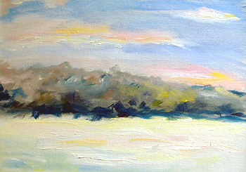
Here’s today’s work, at right.

The colors weren’t accurate in this photo, partly because I took the photo without a flash, and the light was very, very blue from the reflections off the snow.

The photo looks about twice as blue as it is.

Yes, that’s the same painting you saw at the top of this post. 

The snow in the foreground is actually very white, with hints of the myriad colors in it.  To me, the actual painting is very pale and colorful and faerie-like.

When I paint, I ignore anything that’s not lovely.  So, there are elements in front of me that aren’t in the painting.  You can see the actual scene — and three days’ brushes, ready to be scrubbed — in the photo at the left.

That photo also conveys how blue the light was, here in central NH, when I was first photographed the completed sketch.  For example, the floor of our porch is white.  Our living room carpet is a very pale tan color.  And, you can see how blue the snow looks.

Yes, there are buildings, cars, a parking lot… all elements that I leave out.  To me, they’re not lovely or interesting.  (Another artist might see them differently.)

As an artist, I need to feel inspired by what I’m painting.  Mundane aspects of life are necessities for me, but they don’t inspire me.  However, someone influenced by Edward Hopper (work like Nighthawks) would probably talk in very different terms.

The effects of light

The photo at right is the same as the one at the very top of this article. (I’ve placed it here so you don’t have to scroll up & down as you read this.)

Compared with the bluer photo, above on the right…? It looks like a completely different painting.

There are two big lessons from this.

First, when you paint — and the color of the light at that time — makes a huge difference in the colors you see.

That’s not only about the finished art, but the color of the paint on the palette when I’m working.  When the light is really blue, the paint looks bluer than it is, too.  It’s interesting.

The second point is: Light varies considerably with the time of day, the location, reflective surfaces nearby, and so on.  That’s one reason why a completed painting will look completely different in Maine than it does in Arizona.

But, a painting’s colors can vary when you move it from one room to another, as well.  The white walls and red carpet in one room will reflect different colors than the pale blue walls and midnight blue carpet in another.

Generally, I prefer to paint outdoors or in natural light (next to a window).  I also try to paint within two hours of sunrise and two hours at sunset.  At midday, the light is too harsh and white.  Around noon, the shadows aren’t nearly as interesting, either.

Painting technique

My painting technique involves a lot of walking.  I paint a little, and then I walk about ten or 12 feet away, to study the color and composition from a distance.

Then, I paint some more.

I also mix my colors on my brush (or on the canvas), not on the palette.  I scoop a little of one color with the point of a square-tipped brush.  I’ll scoop up another color on the other point of the brush, and then I may add yet another color in the middle of the brush.

As I apply the paint, it blends as I scrub with the bristles.  If I scrub just a little, the colors remain fairly distinct.  If I scrub them a lot, the colors can blend to a uniform shade.

You can see the effect in the photo on the left.  That’s a small, actual size section of the painting.

Anyway, I’m pleased that I’ve painted another sunrise.  This is a good trend.
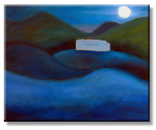
A New Morning

Yesterday, I found a quotation that made me feel much better:

“I’m in a foul mood as I’m making stupid mistakes… This morning I lost beyond repair a painting with which I had been happy, having done about twenty sessions on it; it had to be thoroughly scraped away… what a rage I was in!”

That’s from Claude Monet, one of the greatest artists of all time.  Realizing that even he had to deal with frustration over stupid mistakes… that helped me close the door on my recent difficulties with a painting.

I looked at what’s been going on and remembered that paintings usually take me weeks… two or three months at the most, for an especially challenging (or large) piece.  Anything that takes longer… something else is going on.

And, with that, the skies cleared and I felt much better… not so stalled as an artist.

This morning, I looked out the window and the sunrise was inspiring. The view faces west, so it’s a reflection of the sunrise.

And, after thinking about it for a few minutes, I grabbed my palette and a canvas, and did a quick oil sketch.  That’s it at the top of this post.

It took me about 15 or 20 minutes to lay down the color.  Then, though I wasn’t entirely pleased with it, I knew that it was time to stop.

There’s always a tricky balance between taking a painting almost far enough, and going too far.  The latter involves scrubbing off the paint, or waiting for it to dry to paint over it.

It’s rare to hit that “perfect” point, the same as it’s rare for a baseball player to pitch a no-hitter.

The canvas is 10″ x 14″ and I hadn’t underpainted it with cadmium red, though I usually do that.

The scene is outside my NH living room, looking towards a tree-covered hill.  We still have a lot of snow, and — except for the evergreens — the trees are still fairly stark and grey.  The warmish colors come from the pinks, oranges and yellows of the sunrise.

It’s been years since I was painting morning sunrises.

Spontaneously picking up the paintbrush again… this is a good sign.

When You’ve Got the Blues…

This painting has a quirky history.  It began when a commission wasn’t going well.

When the commissioned painting was completed, a lot of paint remained on my palette.  Most of it was blue.

So, I took another in-progress painting off the wall – one that needed a lot more blue – and I worked on it.

I’ve talked about this painting before.  I’d started it in December, to re-energize myself as an artist, when the commissioned work was faltering yet again.

The fun painting – as it was in December – is at the top of this page.  It started as a good concept, but I wasn’t comfortable working on it much… not until the commission was completed.  (I like to finish what I start, and work in a logical sequence.  That’s probably a Virgo thing, or something like that.)

Late yesterday, with the commissioned painting declared finished and an “Oh, why not” attitude, I began painting on this moonlit landscape again.

Within three minutes, I stepped back and said, “Wow… that’s gorgeous!”

Spalding Inn, Whitefield, NHWith every pause, I felt better.  This painting sings. It’s rich with juicy colors, a rhythmic vision, and I think it conveys the awe and beauty of a moonlit night in the White Mountains of NH.

I’m approaching it as a semi-abstract, and using a tonalist approach.  That is, the edges are soft, and the composition emphasizes light & dark (tones).

That’s the work (in progress) in the photo on the right.

Most of the canvas is finished.  I want to do a little more with the sky.  The trees around the building need to be softened.  And that white rectangle – actually blank canvas – will be filled with the blue of the hotel building.

The nuances of the colors aren’t fully visible in the photo.  For example, the most distant mountain is purple.  The moon is tinged with pale yellow, and the foreground has an almost lyrical mix of French ultramarine and pthalo blue areas.

It’s a lovely painting.

I’m relieved, delighted and thoroughly pleased.   This canvas reminds me of why I’m an artist, and the deep satisfaction of conveying a creative vision in art.

Next

See the next stage of this painting – Small Changes – Big Differences.

Or, skip ahead to my finished painting.

Autumn pond

This is an oil painting from my years (1998 – 2002) in Nashua, New Hampshire.  The pond is at Royal Crest, and it is magnificent all year ’round, but especially during the fall foliage season.

I painted this over a series of afternoons, en plein air (meaning: outdoors, on location).

It’s one of my favorite paintings, and we displayed it in our living room in Texas, as a connection to New England’s magnificent landscapes.

As of late 2008 (shortly after our move to NH), this painting is still in storage.  However, I recall that its dimensions are about 16″ x 20″ on canvas.