This morning’s sunrise began with colors almost identical to the second of Monday’s two sunrise paintings.
I’m working with broader strokes and thicker paint now, and I’m pleased with the results.
For me, the beauty of the landscape has always been in the skies, but also in the untouched aspects of Nature.
The tricky part is getting past pre-conceived ideas of what the colors should be. Trees aren’t always green. Snow is rarely pure white. And so on.
 I’m still working on that.
I’m also working on color-correcting the photos of my paintings. This is close to how the actual painting looks, but the blue-purple band near the horizon isn’t as dark as it looks in the photo.
At right, that image represents a one-inch section of the canvas, to show you the brush strokes in the work, and some of the nuances of color.
In my current work, I’m focusing on three areas:
- More intense colors.
- Greater contrast.
- More expressive brush strokes.
I feel as if I’m making tremendous progress in more vivid, emotionally rich paintings.
This original painting is 9″ x 12″ on canvas board. (That’s canvas stretched over a heavy cardboard backing.)
The medium is water-mixable oils over a cadmium red underpainting.
Water-mixable (and water-soluble) oils are based on the paints used by the “old masters.” Instead of an oil base of linseed oil or other water-resistant oil, these paints return to the traditional oil bases of poppyseed oil, sunflower oil, and so on.
The pigment is the same, no matter what the oil base. The difference is how “green” the cleanup is.
The paints I’m using can be diluted with water, and clean up with soap and water. (I use an organic, non-polluting soap from Maine.)
So, this kind of paint is safer for the environment.
Once dry, my paintings are as permanent and archival as their linseed oil based counterparts.
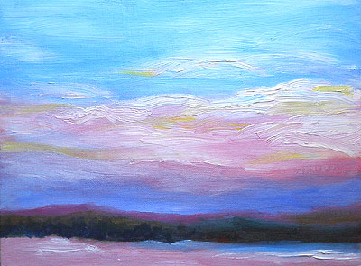
 Then, the entire sky seemed to change in the twinkling of an eye. From purples and teals, the scene shifted to pastels, with lots of pinks and pale turquoises.
 However, at the base of the hill, deep teal and blue colors blended into the murkier greens of this time of year.
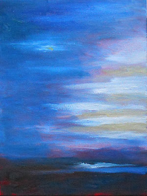
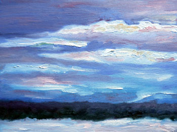
 As usual, I mixed most of my colors on the canvas. That is, I use my brush to pick up selected colors — such as ultramarine blue, pthalo blue, and white — and then blend them as the paint is applied to the canvas.
 The detail at left shows part of the sky in this painting. I wanted to include delicate, almost faerie-like pastel colors, in contrast with the shadows on the foreground.
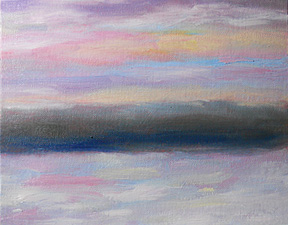
 At right, here’s another detail of the sky. It’s not full-size. It’s reduced from the photo, showing the upper left side of this painting.
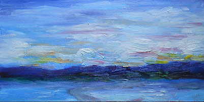
 As usual, the small photo doesn’t show the details in this work. For me, adding color was a matter of whimsy, to highlight the range of colors in the landscape.
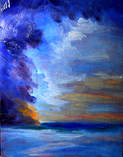
 This sketch — a quick, simple landscape painting — is on an 8″ x 10″ canvasboard. The medium is water-soluble oil paints, applied thickly and with no water or other painting medium.