Orange Hills at Sunset – 8 Jan 2011

I hadn’t planned to paint on Saturday.

My husband and I spent most of the day running errands.  The new indoor farmers’ market in Concord (NH) was a delight, and we returned home with great food items and some yummy-smelling soaps.

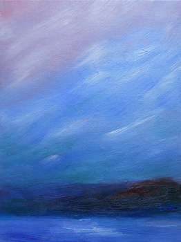
However, as sunset colored the landscape, there was an amazing contrast between the lilac and lavender tones near the horizon, and the contrasting deep red-orange colors of the hills.

Though the sky seemed to retain its blue (also reflected on the snow below) far later than usual, the orange/purple combination was what energized me to quickly sketch the scene.

This is a 9″ x 12″ oil sketch on canvas board.

A later, similar painting: Orange Hills Revisited.

Flurries Near Dusk – 7 Jan 2011

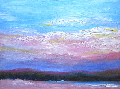
Toward dusk on Friday, the sky had that eerie mix of muted colors, from pink to blue to a greenish-blue cast.

When the colors are that subdued, the more unusual colors in the hills seem to glow, and the snow is dark but intense.

It was lovely, accented by light snow flurries.

Of course, I took out my paints and captured the colors as quickly as I could.

Though I love the coastline, New Hampshire’s interior scenery can be equally powerful in the winter.

This oil sketch will definitely be an inspiration for a larger oil painting.

I’m very pleased with these colors.  They’re subtle, but just dramatic enough.

The original is 9″ x 12″ on canvas board.

Pink-toned Sunrise – 7 Jan 2011

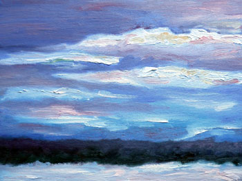
This morning’s sunrise began with colors almost identical to the second of Monday’s two sunrise paintings.

I’m working with broader strokes and thicker paint now, and I’m pleased with the results.

For me, the beauty of the landscape has always been in the skies, but also in the untouched aspects of Nature.

The tricky part is getting past pre-conceived ideas of what the colors should be. Trees aren’t always green.  Snow is rarely pure white.  And so on.

painting detailI’m still working on that.

I’m also working on color-correcting the photos of my paintings.  This is close to how the actual painting looks, but the blue-purple band near the horizon isn’t as dark as it looks in the photo.

At right, that image represents a one-inch section of the canvas, to show you the brush strokes in the work, and some of the nuances of color.

In my current work, I’m focusing on three areas:

  • More intense colors.
  • Greater contrast.
  • More expressive brush strokes.

I feel as if I’m making tremendous progress in more vivid, emotionally rich paintings.

This original painting is 9″ x 12″ on canvas board.  (That’s canvas stretched over a heavy cardboard backing.)

The medium is water-mixable oils over a cadmium red underpainting.

Water-mixable (and water-soluble) oils are based on the paints used by the “old masters.”  Instead of an oil base of linseed oil or other water-resistant oil, these paints return to the traditional oil bases of poppyseed oil, sunflower oil, and so on.

The pigment is the same, no matter what the oil base.  The difference is how “green” the cleanup is.

The paints I’m using can be diluted with water, and clean up with soap and water.  (I use an organic, non-polluting soap from Maine.)

So, this kind of paint is safer for the environment.

Once dry, my paintings are as permanent and archival as their linseed oil based counterparts.

Sunrise Times Two – 3 Jan 2011

This was one of those mornings when I talk to myself.

First, there was the waiting.  I’m sorting out a bunch of goals, etc., so at 5 a.m. I was working in my living room with the drapes wide open, checking the sky every few minutes.

When the early light began to reach the clouds, the transformation was swift and dramatic.  Suddenly, even the snow – mostly melted now – seemed to glow.

Fortunately, I had set out my paints earlier in the morning, so I was ready to paint.

That’s when I started talking to myself… lots of “oohs” and “ahhhs” and other raves about the light & colors.

(The neighbors are used to hearing this. I often talk out loud when I’m creating art. Whether it’s good or not, I’ve always commented about my art as I work. However, I also talk to no one in particular when I see beautiful skies, flowers, ocean views, shooting stars, and Christmas displays.)

By the time this painting was completed, I probably looked a little like Edward Scissorhands, with five different paintbrushes in my left hand and two in my right… each of them slightly askew.

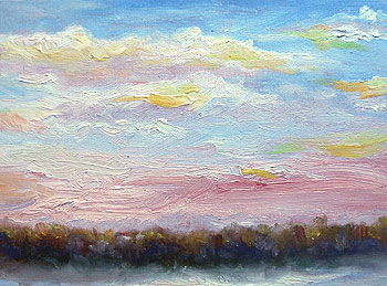
Sunrise painting - 3 Jan 2011 - NHThen, the entire sky seemed to change in the twinkling of an eye.  From purples and teals, the scene shifted to pastels, with lots of pinks and pale turquoises.

(I’m not sure if it was that “red in the morning” sky that predicts a storm, but I later noticed a massive number of seagulls crouching on the grocery store parking lot… a sure sign of rough weather at sea.)

The hillside picked up many of the warmer colors.  Every tree with any remaining leaves was suddenly tipped with flame-like shades of yellow and orange.

Sunrise painting - detail - 3 Jan 2011However, at the base of the hill, deep teal and blue colors blended into the murkier greens of this time of year.

In the foreground, the snow seemed to lose its brilliance, but perhaps that was simply in contrast to the vivid colors in the sky.  I considered keeping the snow in a very high key (almost lurid colors) like the rest of the scene.  Then, I decided that there has to be something in the painting that gives the eye a rest.

I’m working with thicker layers of paint now.  I’m reminded of that advice from early and mid-20th century painters: Put more paint on your palette than you think you’ll need… and then use it all up.

At left, the detail from the painting is pretty much full-sized, but the colors aren’t quite accurate.  For example, the purplish area near the horizon is actually a cherry pink, sort of like cotton candy but darker and richer.

(If you’re a painter, it’s mostly a mix of pure cadmium red and zinc white, with just a touch of cadmium yellow medium in some areas, with a dot of alizarin crimson in others.)

The smaller picture, above, is closer to the correct color, but still not as light & faerie-like as the actual work.

Each of these oil paintings is 9″ x 12″ on canvasboard.   These New England landscape paintings represent typical views in northern New Hampshire.

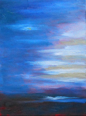
Sunset – New Year’s Eve 2010

This landscape painting was my second of the day on New Year’s Eve 2010.  (The previous one was my sunrise sketch.)

I’m consciously working with greater contrast to convey the colors and emotional content of the scenery.

This oil painting was from after the sun had actually set.  The colors still lingered above the horizon, but the night skies were moving in.

The foreground was already dark.  During the day, most of the snow had melted, so most of the exposed ground was green.

What impressed me most were the subtle colors in the night sky, contrasted with the almost cheerful alternating stripes of white clouds and peach colors near the horizon.

There were also odd, interesting streaks of light on the landscape, reflecting the light and shadows from above.
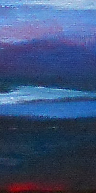
foreground detail - sunset paintingAs usual, I mixed most of my colors on the canvas.  That is, I use my brush to pick up selected colors — such as ultramarine blue, pthalo blue, and white — and then blend them as the paint is applied to the canvas.

At right, the photo shows part of the canvas near the horizon, slightly to the right of center.

The hills were painted with a mix of ultramarine blue and alizarin crimson, plus a dab of white paint.

At the base, I began to include pthalo blue (a teal blue-green) and when I dabbed on the white paint to represent remaining snow, my brush still had some pthalo blue on it.

Closer to the front, I returned to ultramarine blue plus white.  That was to provide a greater warmth to the snowy areas, since the colors were softer there.

Then, the foreground — the grassy areas in deep shadows — were almost a pure mix or ultramarine blue and pthalo blue, with some lemon yellow and cadmium orange.

The red at the very front is cadmium red showing through from the underpainting, though I added cadmium red touches as I completed this work.
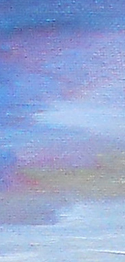
sky detail - New Year's Eve landscape painting 2010 The detail at left shows part of the sky in this painting.  I wanted to include delicate, almost faerie-like pastel colors, in contrast with the shadows on the foreground.

I used almost every color on my palette to create that effect, but it’s mostly ultramarine blue with additional colors added to tint it slightly.

Near the bottom of this detail photo, the clouds are represented by thicker paint toward the horizon.  That’s to give them more depth, and a heavier quality.

Higher up, the clouds seemed more wispy and like they were floating away on helium.

In general, the photo accurately represents the colors of this landscape painting… but not the full contrast or depth of the shades.

(I’ll need to experiment more with my new camera, to see if I can shift the “temperature” of the colors.  Adjusting them in Adobe Photoshop isn’t enough.)
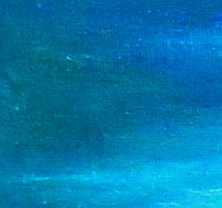
sky detail - NH landscape painting - New Year's Eve 2010At right, here’s another detail of the sky.  It’s not full-size.  It’s reduced from the photo, showing the upper left side of this painting.

In real life, the green is a little darker and the wisp of a cloud (lower right) is whiter.  However, this gives you the general idea of the color range in the sky.

This is a 9″ x 12″ painting on canvasboard.  I used water-soluble oil paints (sometimes called water-miscible oil paints) which are formulated after the paints used the by Old Masters.  They’re just as archival as traditional oil paints, but they’re far “greener” because they don’t use toxic oils as the base, and they clean up with soap & water rather than turpentine.

Once dry, my paintings are just as lasting — and resistant to water — as any other oil painting.

All in all, I’m pleased with the new direction of my paintings.  The heightened colors and contrast are taking me toward the quality of work I want as I resume working on much larger canvases.

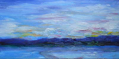
Sunrise – 31 Dec 2010

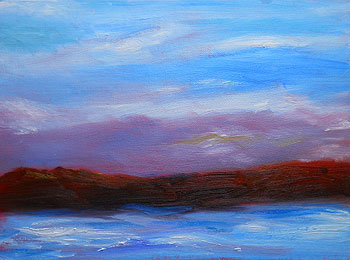
New Year’s Eve morning looked sparkling and bright.  Continuing to enhance the contrast in my work, I completed this oil sketch.  (When I started it, I wasn’t certain that it’s finished, but I figured that it was at least 95% of the way there.)

This is a mostly-southwesterly view, so the sun is behind me as I paint.  This painting represents the sky opposite the rising sun, as the light hits the lowest clouds.

I’m applying paint in thicker layers, and that challenges me to improve my brushstrokes.  Fortunately, I have notes (and memories) from my mother’s instruction, as well as books such as Gruppe on Painting.  (My mother studied with Emile Gruppe in Rockport, Massachusetts.)  My palette follows Gruppe’s recommendations, and it’s kept my colors clean and simple to mix.

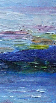
detail - sunrise paintingAs usual, the small photo doesn’t show the details in this work.  For me, adding color was a matter of whimsy, to highlight the range of colors in the landscape.

At right, that’s a detail from near the horizon, toward the right side of the painting.  The colors include alizarin crimson, cadmium yellow, and lemon yellow.  Some were mixed with white.

Generally, I mixed my colors on the canvas, not on the palette.

That is, I picked up some alizarin on one corner of my brush and some white on the other corner, and then blended the colors together on the canvas as I painted.

I like that technique as it adds greater depth and subtlety to the colors.

(That said, there are times when I mix colors on the palette, to get them “just so” for a particular scene.)

I’d like to work on the foreground a little more before I say, “Finished!”  It’s not quite in the same lighthearted style as the rest of the painting… which is what happens when I keep tweaking a perfectly good work.

Sometimes, I just need to work on a picture a second or third time, with a fresh, “Oh, what the heck” attitude, so it doesn’t get too prissy.

This oil painting is on an 8″ x 16″ canvas board, underpainted with cadmium red.  The landscape is from near the Lakes Region of New Hampshire.

Update:

Two weeks later, I tweaked the painting very slightly.  I’m not sure that anyone but me will notice that the path at the front is lighter and more grey.   From my viewpoint, it’s exactly what the painting needed.

Sometimes, these little changes make all the difference in  how the painting looks, where your eye is drawn to, and so on.

I’m happy with this painting now.  In fact, I really like it.  So, it’s officially a completed oil painting.