Pen & Ink – Pandorica Series #1

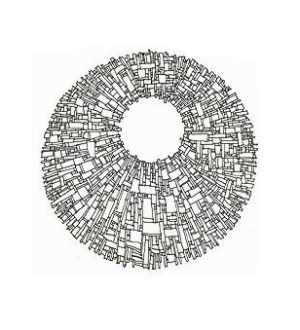
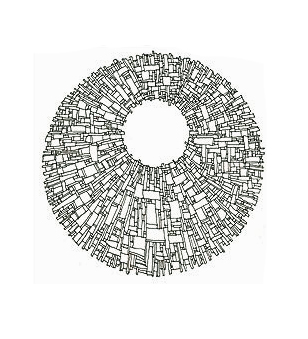
Pandorica #1, pen and ink drawing by Eibhlin Morey
Completed Pandorica drawing –
pen & ink, about 10″ x 10″

Recently, I’ve been thinking about creating a series of abstracts. However, I didn’t have a sense of direction until I re-watched the 2010 Pandorica episodes of the TV series, Dr. Who.

Something about the design on the outside of the box triggered some ideas.

These art concepts also reference the Mayan calendar, mandalas, and steampunk imagery.  However, since the gears started turning (no pun intended) when I saw the Pandorica again… for me, it’s “the Pandorica series.”

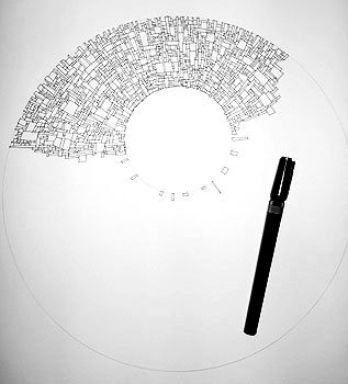
Pandorica - pen and ink illustration in progress
Pandorica, started

Backstory

If you’ve known me from childhood, you probably know I’ve been drawing these boxy designs since junior high school.  These patterns decorated the margins of almost all my school notes.

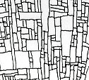
A small section of the finished drawing

Later, they were featured as cards and giant murals, and in the 1980s, CNN commissioned a series of them.

The designs were usually rectangular. I often softened them with swirls and stars as if they were floating in space.

When I looked at the Pandorica again this past week, I suddenly envisioned the boxes in a circle.  I know I want to do something on canvas, but a first attempt in acrylics ruled out one approach that didn’t work.

(I have other canvas-related ideas in mind, some of which I’ll test today.)

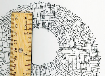
The actual work is black ink on white paper, about 12″ x 12″.

Here’s the scale of the finished artwork.

It took me about three hours to draw this. It’s very detailed, and except for two circles drawn as the general guidelines, I created the design spontaneously.

My initial impulse is to paint outside the circle using black India ink, as if the art is suspended in the darkness of outer space.

For now, I’m leaving this sketch as-is, to serve as a reference for other pieces in this series.

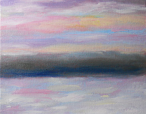
Snow, at dusk

Just past sunset last night, the colors in the sky — and reflected in the snow — were fast-changing and amazing.

If I’d had enough paint set up and enough canvases ready, I probably could have completed three or more sketches last night.  It was a spectacular display of every color in the rainbow!

Mostly, I was amazed that I painted three sketches yesterday.  For years, I always thought I had the energy/inspiration for one or two sketches per day, full stop.

Today’s three sketches — each of them good — have opened a door for me.   I’m seeing where I got some ideas about my limits as an artist.  That’s pretty darned good… in the “better late than never” category, that is!

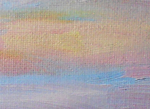
Detail - snow at dusk, 27 dec 2010This sketch — a quick, simple landscape painting — is on an 8″ x 10″ canvasboard.  The medium is water-soluble oil paints, applied thickly and with no water or other painting medium.

At right, you can see some of the detail in the sky.

Though this landscape painting was intended to convey the sense of peace and stillness at dusk, I think there’s a subtle energy in the nuances of color in the sky and the snow.  I deliberately kept the hillside very simple, so not to detract from the other colorful elements in the painting.

For me, this oil sketch is a little gem.  It’s another step toward painting large canvases again.

Interestingly, as I paint these quick sketches, I’m thinking in terms of some abstract works as well.

I’m not sure that I’ll paint today, because I had to scrub my wooden palette this morning — to clear off dried, leftover paint — and it’s still rather soggy.  However, I may sketch a concept for an abstract.

Being an artist is tremendously satisfying.  Oh, it feels risky at every step, but it’s worth it.

People take chances every day, whether it’s crossing the street, getting on a plane, or any of a thousand other risks.  I’m not sure why creating art — and especially putting it in front of the public — feels as scary as it does, but the thrill of creating the art makes it a worthwhile adventure.

Snowy NH afternoon – Dec 2010

This afternoon, the skies began to clear after the overnight blizzard.

The wind is still fierce, blowing snow across the countryside.   It’s lovely… from the warmth of our home, anyway!

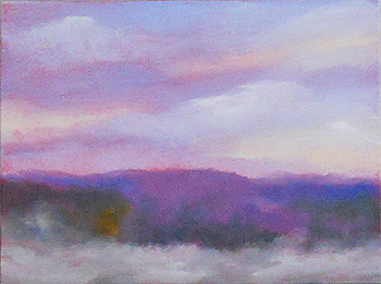
This is a 9″ x 12″ oil sketch on canvas board.  It took me about 20 minutes to paint.

The snow is dry and powdery, and — with the winds gusting — it almost looks like fog blowing through.  At one moment, the roads are clear… then they’re covered with drifting snow, and back to clear again.

The colors are spectacular in the sky, too.  There’s a peachy tone that’s accenting the purples in the distance, and picking up some remaining yellow-ish patches where trees hadn’t fully lost their autumn leaves.

drifting NH snow - hillside landscape paintingAll in all, this is magnificent to look at.

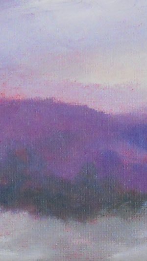
I’m also posting a close-up of one area of the canvas, at right.  I want you to be able to see the subtle, blended colors on the hillside.

Of course, the underpainting of cadmium red helps.  You can see it peering through the colors, giving them warmth.  The red also provides vibrance against the green and blue areas.  It’s the vibrance — the energy — that I reach for when I’m painting.

All in all, I’m very pleased with this sketch.  It captured the moment with all its strength and softness.

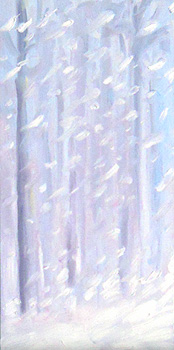
Oil sketch – Blizzard 2010

The news is calling it the “Blizzard of 2010.”  I’m not sure it’s that dramatic, but it’s definitely very white outside.  It began snowing at about 8 last night, and it’s predicted to continue through the morning.

I’ve never tried to paint a snowstorm before, and the landscape is fairly limited.  The hills I usually paint… well, they’re out there, somewhere.  I can’t see even a shadow to suggest them.

Sometimes, I can barely see the moving van parked next to our driveway, as one of our neighbors is moving.  It’s that snowy out, this morning.

Recently, my husband bought me a Wolf Kahn calendar.  It’s to remind me that it’s okay to just paint trees; the views outside three sides of our home are mostly trees.  Lots of trees.

Anyway, that calendar gave me the courage to pick up the paintbrush this morning.  The trees outside my window can be seen now and then, but mostly they’re just shadowy forms in whiteout conditions.

I was trying to capture the stately elegance of the tree trunks, standing very still in the falling snow.  This photo of the finished sketch… well, it doesn’t really convey the actual painting.  (My daughter in Florida wanted this painting, so now it’s in her home.)

For example, the photo doesn’t show the darkest tree trunk clearly. That part of the painting includes shades of blue and yellow, along with the purple tones.

One thing to remember about painting landscapes is that it’s like acting on the Broadway stage: Artistic hyperbole is almost essential to convey what’s going on, with all of its emotional depth.  If you want the people in the nosebleed seats to feel the passion of the moment… play it big.
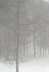
photo of snow scene used for my NH landscape painting - 27 dec 2010In painting – at least the way that I paint – this means representing subtle colors with vibrant shades of paint and broad brush strokes.

So, though the actual view is mostly greyish-brown and white, I looked for the nuances of color in the scene.  That’s part visual, part emotional.

I also wanted to convey the rich intensity of the snow.  For that, I used very thick applications of the oil paint.  Though you can’t see it in the photo, some of the paint stands out about 1/4 inch from the canvas.

(Since white is the slowest color to dry, it may be June before this painting can be handled safely!)

The pure white paint is the trickiest to apply, working alla prima. (Alla prima usually means a painting that’s completed in one sitting.  Especially when the paint is applied thickly, there’s a significant risk that the paint will smear and you’ll lose the line if not the color as well.)

I have a paint rag (torn pieces of an old bed sheet) that’s nearly covered with paint now, as I had to keep wiping the paint off my brush and dipping the bristles into the fresh, untainted white paint on my palette.

(Yes, that paint rag will probably become part of an art project.  At the moment, I’m thinking of cutting it into narrow strips and winding them into cloth beads.)
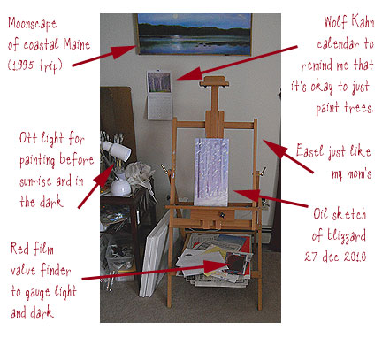
An artist's easel and painting supplies, annotatedAnyway, this is an 8″ x 16″ canvasboard painting.  It had been underpainted with cadmium red, as I usually do.  I created the landscape with water-soluble oil paints, using no water or painting medium to dilute it.  It took me about half an hour to paint this.

While I was playing with the new camera my husband gave me for Christmas, I also took a photo of my easel and annotated the picture.  Here are  more comments, going counter-clockwise around the photo, starting at the upper left:

In that picture, you can see an older oil painting from our summer in Canada. That moonscape was the scene as we crossed the border back into Maine, early one September morning.  We were not far from New Brunswick, and that scene was on our right as we drove south.

I used my Ott light to start today’s painting, and then decided to rely on the available light through my living room’s sliding glass door.

White paint – and any color diluted with it – tends to reflect artificial light.  That makes it difficult to accurately gauge the saturation of the colors, unless you’re viewing it in natural light.

To get the values (light & shade) correctly, I used a red film “value finder” that I’d bought years ago in a quilting supply store.  It’s one of my most useful painting tools.

My easel is just like my mom’s.  When we visited her a couple of years ago, she wanted to give me her easel since she wasn’t using it very often.

Then, we decided that it was better for Mum to leave it to my niece, Rachel Morey, who’s very artistic, too.  (My mother was so pleased that at least one of my brother’s children had inherited an interest in art.)

I bought my own, similar easel when we arrived in NH from TX.

And finally in that photo, the Wolf Kahn calendar is tiny, but it’s enough to remind me of the impact of color and design, so I don’t cling to the idea that the subject itself has to be interesting.

Before we move, I hope to take more advantage of the lovely tree-filled landscapes that cover almost the entire block, across the street from my home.  It’s a beautiful scene, and a fresh challenge for me!
Sunrise – Christmas Eve 2010

It’s Christmas Eve. One of my favorite times of year. As a child, we often went to Midnight Mass. That’s a tradition I continued with my children, too.

Then and now, Christmas Eve seems more of a fresh beginning than New Year’s Day. That probably reflects my upbringing and personal context.

But also, as an artist who studies light, I know that – in astronomical terms – this is the winter solstice. (Solstices mark the first day of winter and of summer, respectively.)

For me, those days mark when the light really changes.  In my opinions, winters and summers often produce the most remarkable skies.

That’s how it should be.  After all, spring and autumn have their own colors – flowering plants and fall foliage – so the skies have no need to contribute to the brilliance.

So, this time of year means more vivid sunrises and, sometimes, more colorful sunsets.  It means longer, more purplish shadows and whiter noonday sunlight.

The sunrises are what matters most to me, as that’s when I really enjoy sketching.

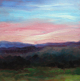
This morning – Christmas Eve day – I was delighted to see the sky’s shades of peach to pale magenta to teal to blue.  They were slightly echoed in the grey trees on a neighboring hillside.

Detail, sunrise sketch by Eileen Eilis Morey, 24 Dec 2010With my breakfast getting cold on the sideboard, I was at my easel, painting as quickly as I could.  For me, it’s important to be inspired by the colors, but also to have them as references as I work.
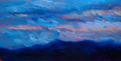
I’m very pleased with this sketch.  It’s very representative of the Lakes and White Mountain areas of New Hampshire.  The mountains always provide a sense of depth, but – because they’re not towering – they’re also very sheltering and comforting.

On Christmas Eve day, that’s a very nice feeling.

At right, you can see some details from this sketch.  As usual, I’d underpainted the canvas with cadmium red.  You can see the red peering through from behind thinner areas of paint.

Then, I used water-soluble oil paints for the sketch.  My palette is based on the colors recommended by Emile Gruppe, with whom my mother studied:  Ultramarine blue, Alizarin crimson, Cadmium red, Cadmium orange, Cadmium yellow, Lemon yellow, and Pthalo blue.  I also use white, and sometimes Sap green; I’m out of the latter right now, so I mixed my own greens for this painting.

I used three paintbrushes:  One for the blue sky, and one for the peach-to-pink sky areas.  Keeping those separate keeps the colors clean and true.

The rest of the painting was finished with the third paintbrush, starting with the purple areas and then adding blues and eventually greens.

Because those colors needed to blend, I simply kept painting with the same brush.  I didn’t use any water or painting medium… I just went straight to the canvas from the palette.

The canvas board is 12″ x 12″ and the sketch took me about 20 minutes to complete.  It was one of those works that seemed entirely inspired, and no tweaking, overpainting or corrections were necessary.

I’m very pleased with it, particularly the subtlety of the colors.

This sketch will be a (slightly late) present for my husband’s aunt.  She has a very artistic and creative home, and it’ll look perfect in that setting.

Oil Sketch – Blustery Sunset

As sunset approached, the winds picked up and the weather turned blustery.  The clouds were heavy shades of blue over the golden-to-magenta sky.

Of course, I dashed to my easel.

My paints were still on my palette after the morning’s oil sketch, so — just adding more zinc white — I was ready to paint again.

Once again, my Ott light made this work possible.  Otherwise, my options would have been (a) paint in the dark, or (b) use normal artificial light with its unnatural colors.

Mostly, I wanted to capture the sweep of the clouds and the vivid colors in contrast.

This time, for amusement, I timed myself.  This sketch took 12 minutes.  However, I spent about 30 seconds softening one area of it this morning, when I saw the sketch in the daylight.

One of my biggest difficulties is knowing when to stop working on a painting or a sketch.  I’d rather keep the fresh, raw energy in it, than turn out a more perfect (but relatively sterile) canvas.

This is an 8″ x 16″ sketch on canvas board.  I used water-soluble oil paints and boar bristle brushes, usually flats.

In real life, the sky colors (pinks, yellows and oranges) glow more than you can see in the photo.

All in all, I’m very pleased with this sketch.