It’s Christmas Eve. One of my favorite times of year. As a child, we often went to Midnight Mass. That’s a tradition I continued with my children, too.
Then and now, Christmas Eve seems more of a fresh beginning than New Year’s Day. That probably reflects my upbringing and personal context.
But also, as an artist who studies light, I know that – in astronomical terms – this is the winter solstice. (Solstices mark the first day of winter and of summer, respectively.)
For me, those days mark when the light really changes. In my opinions, winters and summers often produce the most remarkable skies.
That’s how it should be. After all, spring and autumn have their own colors – flowering plants and fall foliage – so the skies have no need to contribute to the brilliance.
So, this time of year means more vivid sunrises and, sometimes, more colorful sunsets. It means longer, more purplish shadows and whiter noonday sunlight.
The sunrises are what matters most to me, as that’s when I really enjoy sketching.
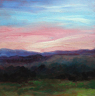
This morning – Christmas Eve day – I was delighted to see the sky’s shades of peach to pale magenta to teal to blue. They were slightly echoed in the grey trees on a neighboring hillside.
 With my breakfast getting cold on the sideboard, I was at my easel, painting as quickly as I could. For me, it’s important to be inspired by the colors, but also to have them as references as I work.
I’m very pleased with this sketch. It’s very representative of the Lakes and White Mountain areas of New Hampshire. The mountains always provide a sense of depth, but – because they’re not towering – they’re also very sheltering and comforting.
On Christmas Eve day, that’s a very nice feeling.
At right, you can see some details from this sketch. As usual, I’d underpainted the canvas with cadmium red. You can see the red peering through from behind thinner areas of paint.
Then, I used water-soluble oil paints for the sketch. My palette is based on the colors recommended by Emile Gruppe, with whom my mother studied: Ultramarine blue, Alizarin crimson, Cadmium red, Cadmium orange, Cadmium yellow, Lemon yellow, and Pthalo blue. I also use white, and sometimes Sap green; I’m out of the latter right now, so I mixed my own greens for this painting.
I used three paintbrushes: One for the blue sky, and one for the peach-to-pink sky areas. Keeping those separate keeps the colors clean and true.
The rest of the painting was finished with the third paintbrush, starting with the purple areas and then adding blues and eventually greens.
Because those colors needed to blend, I simply kept painting with the same brush. I didn’t use any water or painting medium… I just went straight to the canvas from the palette.
The canvas board is 12″ x 12″ and the sketch took me about 20 minutes to complete. It was one of those works that seemed entirely inspired, and no tweaking, overpainting or corrections were necessary.
I’m very pleased with it, particularly the subtlety of the colors.
This sketch will be a (slightly late) present for my husband’s aunt. She has a very artistic and creative home, and it’ll look perfect in that setting.

