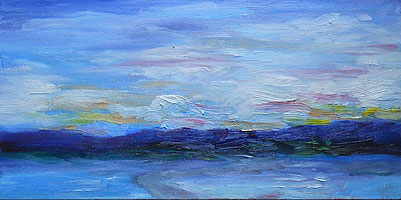
New Year’s Eve morning looked sparkling and bright. Continuing to enhance the contrast in my work, I completed this oil sketch. (When I started it, I wasn’t certain that it’s finished, but I figured that it was at least 95% of the way there.)
This is a mostly-southwesterly view, so the sun is behind me as I paint. This painting represents the sky opposite the rising sun, as the light hits the lowest clouds.
I’m applying paint in thicker layers, and that challenges me to improve my brushstrokes. Fortunately, I have notes (and memories) from my mother’s instruction, as well as books such as Gruppe on Painting. (My mother studied with Emile Gruppe in Rockport, Massachusetts.) My palette follows Gruppe’s recommendations, and it’s kept my colors clean and simple to mix.
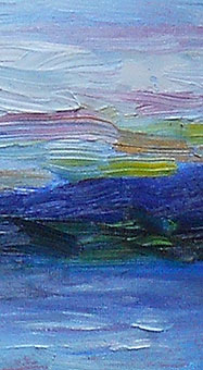
 As usual, the small photo doesn’t show the details in this work. For me, adding color was a matter of whimsy, to highlight the range of colors in the landscape.
At right, that’s a detail from near the horizon, toward the right side of the painting. The colors include alizarin crimson, cadmium yellow, and lemon yellow. Some were mixed with white.
Generally, I mixed my colors on the canvas, not on the palette.
That is, I picked up some alizarin on one corner of my brush and some white on the other corner, and then blended the colors together on the canvas as I painted.
I like that technique as it adds greater depth and subtlety to the colors.
(That said, there are times when I mix colors on the palette, to get them “just so” for a particular scene.)
I’d like to work on the foreground a little more before I say, “Finished!” It’s not quite in the same lighthearted style as the rest of the painting… which is what happens when I keep tweaking a perfectly good work.
Sometimes, I just need to work on a picture a second or third time, with a fresh, “Oh, what the heck” attitude, so it doesn’t get too prissy.
This oil painting is on an 8″ x 16″ canvas board, underpainted with cadmium red. The landscape is from near the Lakes Region of New Hampshire.
Update:
Two weeks later, I tweaked the painting very slightly. I’m not sure that anyone but me will notice that the path at the front is lighter and more grey. From my viewpoint, it’s exactly what the painting needed.
Sometimes, these little changes make all the difference in how the painting looks, where your eye is drawn to, and so on.
I’m happy with this painting now. In fact, I really like it. So, it’s officially a completed oil painting.

