Among the many things I love about being an artist is the joy I take in colors. Whether they’re the vibrant shades of spring and autumn, or the subtle greys of winter and the sizzling whites of summer… I love color!
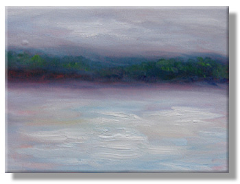
This morning, the skies were heavy with rain. The colors were similar to yesterday’s sunrise, but different, too. I think I captured them well in today’s sunrise oil sketch, on the right.
This is a 9″ x 12″ oil sketch (quick painting) on canvas board.
I wanted to include the subtle colors of the moment, but also the heavy, burdened quality of the clouds. With them, there’s an expectancy in the landscape, as birds wait in the trees and everything seems very quiet.
Like yesterday’s sketch (Day Three – Snowrise Sketch), this canvas was underpainted with cadmium red.
That red serves two purposes: It can make the colors over it seem to “pop” and it’s also a medium tone to start with. Using it as a reference, I can adjust the lights and darks so they convey the tones of the landscape I’m trying to capture.
 A few bubbles came up on the left side of the canvas as I was painting. If they don’t smooth as the work dries, I may trim the painting and restretch the canvas.
An inch or two off the left side won’t significantly alter the painting’s balance or artistic value.
However, the bubbles are likely to flatten, just as paper sometimes buckles when it’s freshly glued, but smooths as it dries.
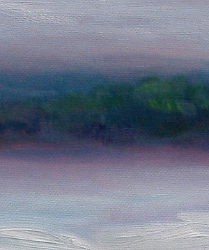
At left, you can see some of the details in this painting. Though you might think the trees are blurred, look at the brushstrokes above and below the hillside. The strokes are crisp.
In other words, the trees on the hill really are painted that softly. I wanted to convey the blurry effect of the fog that’s just starting to creep in, ahead of the rain.
Brushes
About 90% of this painting was painted with #10 boar bristle “bright” (short, square-tipped) paintbrushes. Initially, I roughed-in the hillside with a #12 boar bristle bright. I also used two other bristle-type brushes: A #6 filbert (rounded tip) and a #8 boar bright.
Palette
My colors were almost entirely French ultramarine blue, lemon yellow, and cadmium yellow, with a touch of cadmium red.
Yes, with just the three primary colors — red, yellow and blue — you really can mix almost any color.
I often blend a basic green on my palette, but nearly everything else is mixed on the brush, or as I scrub (or lay) the paint on the canvas.
What’s next
I’m hoping for a more vivid, colorful sunrise tomorrow. However, I’ll be equally pleased if it’s another grey morning. I’d like to try a purely tonalist (lights & darks) work with pthalo (turquoise) blues and whites.
It’s wonderful to look forward to the morning, no matter what the weather brings!

