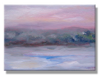
There was no actual sunrise this morning. Not that I could see, anyway. I wondered if my neighbor, Lesley, was thinking, “There’s no way she’s painting a sunrise this morning.”
But… I did! Okay, I’m calling it a “snowrise” because it’s not sunny at all. The could cover is heavy, and as soon as I finished this sketch, it started snowing.
This morning, I was better prepared to paint. My friend, Erin, had asked about my canvases and whether I treat them with gesso ahead of time. (My lengthy reply is in a comment at Daily Sunrises – Day Two.)
The idea of layers of gesso – sanded smooth – is to banish all evidence of texture from the canvas. Then, the artist can lay in a very fine amount of paint and the painting is uniformly smooth; the only texture is from the actual brushstrokes of the oil paint.
I didn’t have time to gesso a canvas last night, but I did rummage through my canvases to find some canvas boards that had been underpainted with cadmium red. I generally use them in the field when I’m painting landscapes. There, I often lay in the paint so heavily, gesso wouldn’t make a difference.
Anyway, I decided to try a canvas that had been underpainted with cadmium red. The theory behind that is: Colors seem to “glow” more when cad red is under them.
I learned that trick from some correspondence by Claude Monet. Don’t ask where I found it; I read it years & years ago, delving into dusty old books that included some of his letters.
I have no idea if he tried it once, used it regularly, or… well, something in-between.
This morning, the sky was generally bleak and gray, as was most of the landscape. Then, for just a fleeting moment, I saw faint hints of color. That’s when I dragged my easel to the window, and started painting furiously. I wanted to capture the colors while I could see them, or at least while they were still fresh in my memory.
So, that’s the result, at the top of this page. I’m very pleased with it. I’m calling it “Snow’s on the Way.”
(Update: You can compare it with the sketch that I did the next day: Exploring the Grey.)
————————-
Details
My palette included the following colors:
- Titanium white
- Pthalo blue
- Lemon yellow
- Cadmium yellow
- Cadmium orange
- Cadmium red deep
- Alizarin crimson
- French ultramarine blue
Generally, those are the only colors I paint with. Sometimes, I’ll use Hooker’s green or a Sap green. If I’m trying to capture a landscape in a hurry, that’s a shortcut I’m willing to use.
Otherwise, I mix my own greens, and this palette works well in any setting, indoors or in natural, outdoor light (plein air).
My palette is based on the recommendations by Emile Gruppe, one of my mother’s teachers. His book, Brushwork: A Guide to Expressive Brushwork for Oil Painting, is worth its weight in gold, if you can find a copy.
The brushes
 I’m usually using large, boar bristle brushes, and the average size is 8 or 10. Half of them are the cheapest I can find at the discount art supply store.
(Yes, the shedding bristles are annoying, but — after the brushes are broken in — they don’t shed that much. Also, I can throw them away with a clear conscience when — after a year or two — they’re hopelessly clogged with old, dried paint.)
Most of my brushes are “flats” and have very square ends, and a few are “filberts” with rounded tips.
Sometimes, just before the painting is completed, I use a couple of softer brushes to smooth areas of color… to soften the edges between tones and colors. For that, I have a lovely Langnickel Royal Sable brush, a “bright” in size 16, but any high-quality sable “bright” or blender would probably work.
To blend edges on larger canvases, I have a very fancy blender-style paintbrush — about two inches wide — intended for use with faux finishes.
In other words, I don’t hesitate to spend money when the brush is worth it.
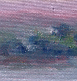
Above, at the left, you can see a detail of today’s painting.
(Those greens were blended with pthalo blue and lemon yellow, and the greys were a mix of French ultramarine blue with cadmium yellow or cadmium orange.)
My paints
My paints are generally water-soluble oils, and primarily Winsor & Newton Artisan paints or Grumbacher’s Max oils.
“Water soluble” (sometimes called “water miscible”) means that I dilute them with water, and cleanup involves soap and water. No turpentine at all. If I want to use linseed oil or another medium when I’m painting, there are special water-soluble versions, as well.
No harsh odors. No risk of allergies. (My mother developed an allergy to turpentine. That’s not unusual among lifelong artists.)
To learn more, see the product info page: Grumbacher Max Artists’ Oil Colors
For the past 15 years, I’ve used water-soluble oil paints almost exclusively. Initially, I mixed my traditional oil paints with them, to use up the old colors. (You can do that, up to 30% traditional paint with 70% water-soluble paints.)
Once my older paints were gone, I never went back to traditional oils.
Though some people worry about these paints, I spoke for several hours with Grumbacher’s lead chemist. He explained that the paints were inspired by the blends of the “old masters” in painting: They used oils such as poppy seed oil to mix their pigments, and those oils mix well with water.
These paints were lab-tested to be sure they’re as archival as any other oil paint. I have no qualms about my art lasting for hundreds of years, as odd as it sounds when I say that. (Blame it on years of Catholic school; I’m usually uncomfortable when I say anything that could suggest pride! *LOL*)
Though these paints not actually water soluble, they’re easier to wash out of the brush than if you were painting with, say, salad dressing. And, these paints do dilute with water as a painting medium.

