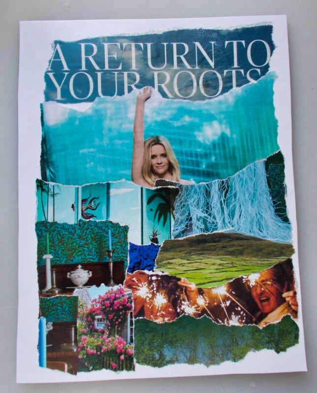
Return to Your Roots – A Collage About Home

Our roots… what are they? Are they about home and traditions? About family and friends (or perhaps friends who’ve become our family)? About authenticity? About a sense of self, independent of external cues and constraints?

Or, can we embrace all of those elements in unique ways that are about us, personally?

For me, this torn-paper collage was a deeply personal expression of who I am and what represents the many faces of my self.  

In a way, it’s where my internal compass points. Wherever I am, this is the essence of “home.”

I’m not sure I can articulate what each element means, but it felt intuitively right and familiar, and each belonged in this statement.

Size: 8.5″ x 11″

Materials: Poster board, torn magazine images and text, Yes Paste


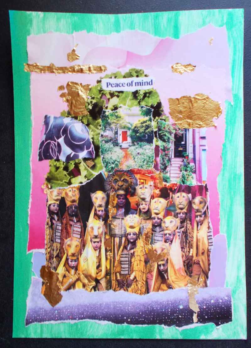
Peace of Mind – Torn-Paper Collage

What does this collage mean…? I have no idea. My creative process is intuitive.

(And yes, this photo is blurry. I took the picture, hand-held and in low-light conditions. For now, it’s “good enough,” at least until I decide whether to do more with this piece. Then I’ll scan or re-photograph it.)

Here’s how I work on art like this:

I gather pieces. I see which make visual sense, together. I don’t go looking for logic. Not intellectually, anyway.

The process is entirely visual.

Then I assemble the collage elements – loosely and without adhesive – and see if they still work.

This one is still a work in progress.

I have no idea how “peace of mind” relates to kale, some New England gardens and front doors, the colors of the Paris sky, and the cast of The Lion King.

But there it is. And, stepping back from it, I can see a symmetry in the design that echoes the costuming of the Lion King cast.

I’m not 100% pleased with the balance… yet. It needs something… maybe.

Or it might be “creative ennui.” I seem to go through that with some pieces, and – a few days later – decide that the piece is actually fine, as-is.

I’m posting this anyway, because I want to represent the process as I go along.

And, at some point, I may realize what this piece means. Until then, you may see things in it that make sense to you. Or not.

I’m pleased with the visual logic of this, and – sometimes – that’s all I’m aiming for.

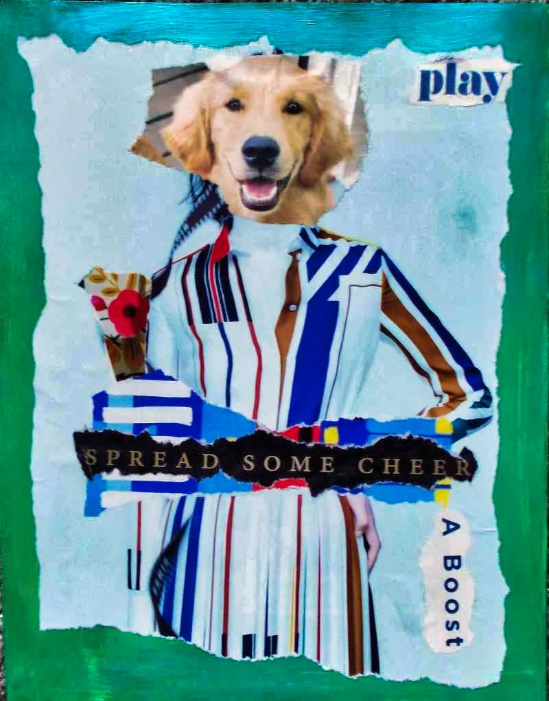
Play… with Elegance – Torn-Paper Collage

It started with a puppy’s cute face.

Then, because my humor is quirky, I realized the puppy’s face would fit perfectly on an Hermes ad from a British fashion magazine.

With a few added details, this torn-paper collage – the only one I created this past weekend – seemed complete.

Sometimes, the simplest collages are the most effective.

Play, and spread some cheer!

P.S. The support for this collage was painted green, and then applied a slightly sheer layer of iridescent teal blue. I’ll replace this photo with a better one, later, but – for now – it conveys the general idea behind this art.

(And yes, my husband quoted “Ghostbusters,” saying something like, “Okay, so she’s a dog.” Because his humor is quirky, too.)

Things I learned, creating this collage:

Simple can be fun. It’s far to easy for me to keep adding collage elements when the work might be better with a greater sense of space.

Using glue stick as the adhesive prevents more buckling and bubbling than gel medium, but the adhesion isn’t as consistent, especially as glue stick dries so quickly. And, once placed, the glue holds almost immediately, so fewer adjustments are possible.

But, for small collage elements, where I can place the piece lightly (and make minor adjustments) and then press it down, glue stick can be better than gel medium.

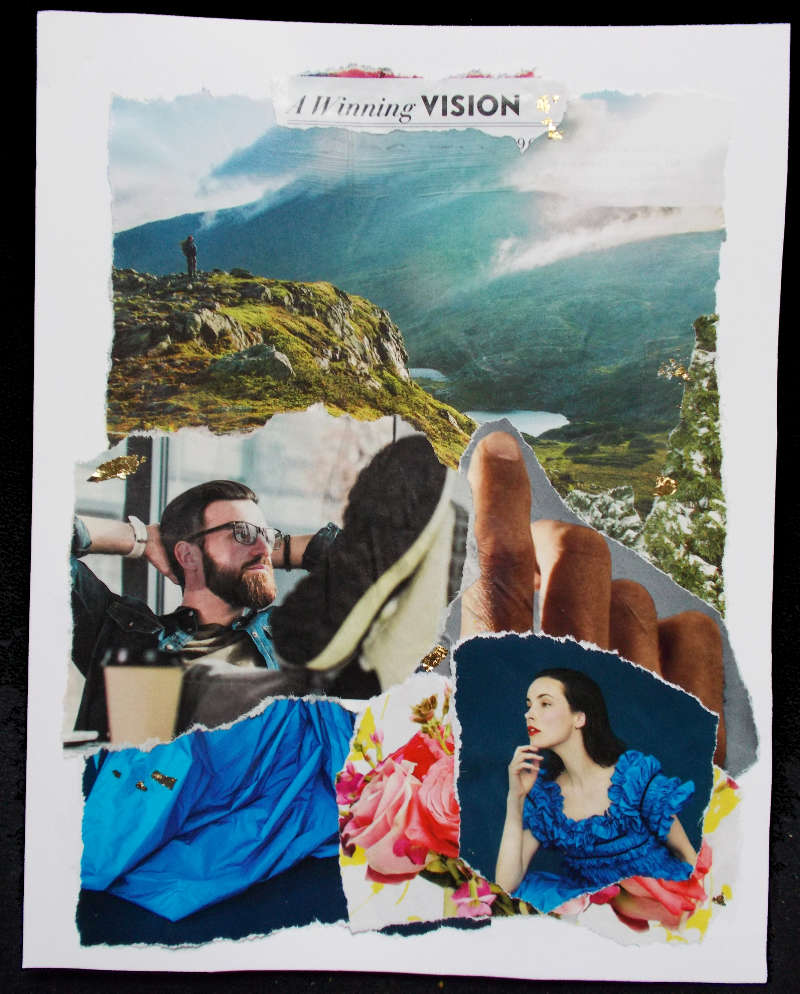
A Winning Vision? Collage Enigma – The Viewer Decides

This morning’s collage is a deliberate enigma. Also, I’ve decided that – after yesterday’s efforts – it may be best to leave the meaning of the collage to the observer. After all, that was my initial plan for this series.

So, is he thinking of her (and perhaps the rustle of her blue dress), of the landscape, or something else?

Is she wondering about him, and is he the one that sent her flowers?

Does the finger point to what they’re both dreaming about?

Do their dreams – their visions – intersect? Or, is this very early in the relationship?

Or, do they even know each other… yet?

It’s definitely an “..in the eye of the beholder” kind of piece.

divider

Things I learned, creating this collage:

Most American magazines seem to be printed on cheap, thin, very porous paper. National Geographic is an exception. Town & Country (American magazine) is on better paper than, say, Better Homes & Gardens, Wired, and Vanity Fair.

The British editions of Harper’s Bazaar and Elle are on paper close to the quality of Nat’l Geographic. For collage, it’s worth spending extra for them.

When working with cheap paper, it’s best to apply the gel medium (adhesive) to the support rather than directly on the collage element. This makes element placement far more challenging, but it reduces buckling and bubbling… only slightly. (“Slightly” may be as good as it gets. So, I’m reminding myself that this shows the process in the finished art, and that’s okay.)

Some collages have a vision (no pun intended, with this work) from the start, while others – like yesterday’s piece – are a process.

It’s probably similar to the writing process: Some authors are “plotters” (plan the story, sometimes in great detail, ahead of time) but others are “pantsers” (writing with a vague idea, and making it up – flying “by the seat of one’s pants” – as they go along).

And sometimes, even the most dedicated, focused “plotters” suddenly find their stories going in a weird (but wonderful?) direction, and they go with it.


Authenticity in a Time of Challenge – Collage

Today’s collage is – like yesterday’s – not quite finished. But, for now, it’s going to sit. I want to look at it for a while, and see what else it says to me. See if anything is missing or needs… something.

That’s a challenge for me, because this isn’t my usual design style.

The foundation

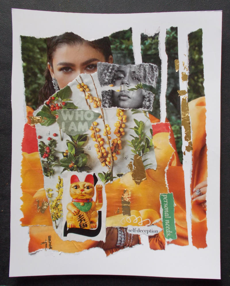
This piece started with the first layer, showing a smiling model in a tangerine/orange satin gown and an almost ostentatious amount of glittery jewelry.

But – for me – the model’s eyes didn’t match her smile.

Years ago, looking at portraits, I learned to ignore (or even cover) the lower half of the person’s face. The eyes showed the person’s real emotions.

So, as I built this collage, the first thing I did was to cover the lower half of the model’s face. The new layer featured seasonal plants and berries. The colors resonated with the background image, but the texture – and the almost-careless untidiness of Nature – was a sharp contrast.

Suddenly, this collage was about authenticity. The look in the model’s eyes… what is it? Sadness? Distance from everything around her?

That’s when I tore the background image into strips. I chose to apply them randomly, out of order, and with emptiness between them.

Again, that’s a reference to an emerging sense of artifice as I studied the photo.

Next, contrasts and similarities

The next step was to study other magazine photos. I wanted to see if the expression in other models’ eyes were lacking, or at least didn’t match the rest of the face.

When I found the black-and-white image, it seemed perfect. That model’s eyes and mouth, and the tilt of her head, all delivered the same message. I emphasized that by disconnecting them – tearing that image in half. It’s a harsh contrast – in color (b&w), in consistency, and style – against the original layer in this collage.

I began gluing the collage elements in earnest when I found an ad for macaroni and cheese. The colors in that advertisement perfectly matched the orange satin gown. It’s almost difficult to tell what’s macaroni and what’s the gown. And, in contrast with the lifestyle represented by the amount of jewelry in the original image, I also wanted to note the number of people for whom macaroni and cheese – from a box – is considered a luxury meal.

It would be trite to talk about the shallow lives of those driven by status and symbols of wealth, but – as I kept working on this collage – the reference was almost unavoidable.

Final clues

The words “who I am” are almost lost in the busyness of the design. “Personal needs” is slightly tilted, as much of the rest of the images is. And then there’s the crisp statement, “self-deception” in black and white, with a childish scribble leading to it.

The final elements – the heavily made-up “lucky cat” (Maneki-neko) and ragged gold leaf – fit both the color & theme of this piece.

In some ways, this collage lacks drama, deliberately. It’s less visually appealing than what I usually aspire to, with my art.

But, at a time when – wearing masks – we rely so heavily on the emotion expressed with one’s eyes, and we’re witnessing a stunning, rapidly expanding gap between the “haves” and “have-nots,” I’m pleased with the statement of this piece.

It’s about authenticity.

In a world where things can feel tumultuous and destabilizing, maybe authenticity is the touchstone… the sense of self that keeps us grounded.

Empowered.

Able to achieve what we’ve always suspected we can do.

And, once again drifting into irony, I’m remembering the song lyrics in “Grease.” Perhaps – more than ever, as we choose our personal paths to the new “normal” – it’s time to believe that we can be who we are.

Click here to see all of my recent collages

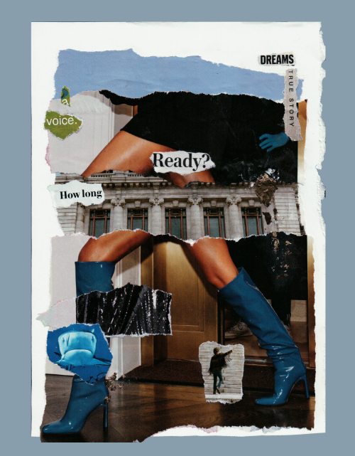
Dreams / True Story Collage

What kinds of stories can art tell? And can you be part of that process?

I believe most artists want their work to be interactive… emotionally, anyway.

My collages used to be about me. The art was mine. The stories were mine, too.

Now, with this new collage – the first in about a decade – I see myself assembling pieces of a story.

It’s not necessarily my story.

In fact, each viewer is the owner.

The story they see in my collages is theirs alone… unless they share it with others, of course.

The scan of this collage, above, is preliminary. The bottom edge of the torn paper (below her left boot) is actually just as ragged as the rest, but the scanner didn’t include it. (I’ll fix this, later.)  Also, the gold trailing behind her is bright & shiny, but – in the scan – it’s dull. (I’ll make sure it shows when the collage is fully finished. At this point, it’s not actually mounted on a contrasting background.)

So… what is her story?

Here are elements and questions to consider, looking at this collage:

Is she walking – perhaps running – towards something, or away from it, or both? The right side of the collage support (white) is torn and untidy, while the right side was cut with a ruler. Does that mean anything in the context of her story?

“Dreams” and “true story” are separated. Are they still connected? Does her true story support her dreams, or has the truth fallen off and it’s now at odds with her dreams?

Likewise, “a voice”… is it fractured? Or is her inner voice leading the way, a little here and a little there, and how long will her journey be? (As I see it, both “a voice” and “How long” are sort of floating in front of her.)

Perhaps the building (a symbol of tradition, or authority?) supports her. Maybe it’s interrupting her progress, and she’ll soon leave it behind.

There’s a shark at her leading ankle. Has it already passed her, and does she care?

And the figure in the 60s-style fringed jacket, possibly pointing at the male figure in the shadowy background. Is that a warning? If so, is it to her or to the mostly hidden man?

But, of course, the big question is: Is she ready?

Click here to see all of my recent collages

If you’d like to create your own collages – visit my original mixed media art site, Aisling.net

(It’s been online since the mid-1990s. Back then, women were very much in the minority, online, so some of us chose to use pen names to protect our privacy.)